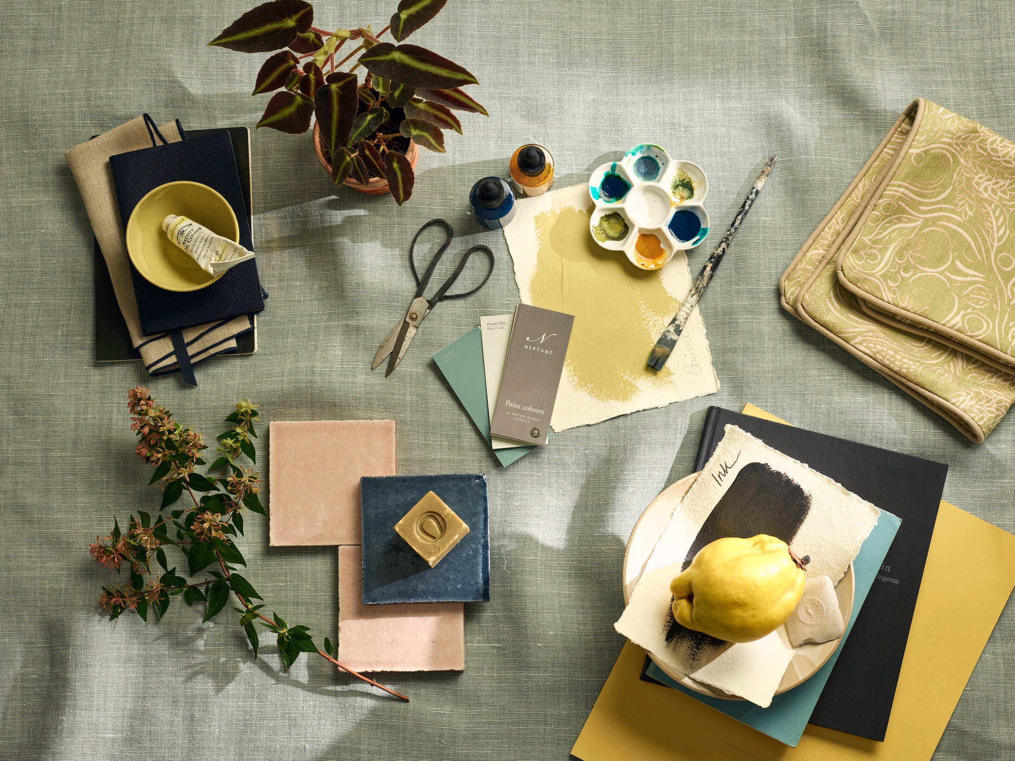
In a large room, take the furniture away from the walls, and instead, use internal architecture like fireplaces and windows to set centre lines to base the layout around. While this might feel counter-intuitive, it actually makes the room feel more spacious and avoids leaving an empty space in the middle of the room. Introduce an expansive rug ³Ù´ÇÌý
ground the seating area. Use the walls for bookshelves or to display art and fill corners with a small desk, like the Ardingly, balanced in the opposite corner with a large plant.
If you don’t have architectural elements to design around, position a large piece of furniture, like a dresser or tv cabinet, to hold the scheme. Break the long space into two with a corner sofa and console behind, extending into the central space to create a low room divide. Then dress the console with tall lamps or flowers to add height but allow light through. A square shaped coffee table interrupts the linear lines of the room, making the space feel more visually interesting. An upholstered chair or love seat in the corner ‘rounds� out the conversation area and use the other end of the long room to create a library or study area.
With unusually shaped rooms or those with lots of doors or even a staircase, it can be tempting to push all the furniture against the walls. However, there is a lot of architectural ‘noiseâ€� in such spaces, so it is important to keep the room feeling smart, organised and uncluttered. Circulation is key to make the room feel comfortable, and we recommend leaving at least 80cmÌýbetween furniture and wall for good flow. Keep walls clear and divide the floorplan in³Ù´ÇÌýuseable blocks to which you can assign areas. Here there is a compact sofa area â€� we usedÌýthe slim lines of the George sofa â€� centred on a rug, and a reception area centred aroundÌýa pedestal table like the Sheldrake round dining table, which encourages flow in bothÌýdirections. A dark, unused corner under the stairs is utilised as a seating or reading area.Ìý
Ìý
Ìý
]]>Read on for our guide to all the styles ²â´Ç³Ü’l±ô find in our outdoor collection.Ìý
Whether ²â´Ç³Ü’r±ð drawn to the sculptural simplicity of steel, the tactility of timber, or versatility of wicker, our collection caters to every taste. With a wide breadth of choice, ·É±ð’v±ð categorised our collection so you can easily navigate which design suits your garden style:ÌýÌý
µþ´Ç²õ³¦´Ç³¾²ú±ð’s elegant and simple metal framesÌýfeature subtly romantic curls as a nod to Victorian patio pieces. The tabletop is made from a durable polished granite that complements the metal frame.ÌýÌý
Why we love it: One of our dining collections with a smaller footprint, Boscombe is particularly well suited to petite gardens and tucked-away corners.Ìý
Crafted from galvanised steel and granite, the matt, dark grey finish on the metal frames (a slightly subtler take on the usual black) and the stepped edge on the tabletop (more elegant, less weighty) make this a decorative choice for any garden. It comes with the option of natural or green stripe cushions.ÌýÌý
Why we love it: °ä³ó±ð±ô³Ù±ð²Ô³ó²¹³¾â€™s sweeping curves are inspired by the Regency balconies and railings of its namesake spa town.Ìý
Longmeadow's contemporary lattice design lets sunlight shine through and is crafted from UV-resistant all-weather wicker, meticulously handwoven around a rust-proof aluminium frame. Comes with weather-resistant seat cushions for relaxed comfort.Ìý
Why we love it: One of our relaxed seating collections with a larger footprint, Long Meadow is particularly well suited to large patios and sprawling lawns.Ìý
Bryher combines indoor upholstery styles with the practicalities of garden furniture â€� think teak legs on all-weather wicker, and button-back detailing on weather-resistant, washable cushions. ±õ³Ù’s a refined collection with a curving side profile and slim arms.ÌýÌý
With its rounded, laid-back shape and modular sofa design, Compton feels like a cosy addition to gardens and ·É´Ç³Ü±ô»å²Ô’t be out of place used to soften a modern balcony. Crafted from all-weather wicker, its natural tones complement stone and timber, and gives texture to outdoor spaces.Ìý
Why we love it: The smaller footprint makes it good for tight spaces, and it has clever storage space underneath the seats.Ìý
One of our most traditional collections, Harrington is made from all-weather wicker with an intricate lattice detail in the weave. The dark grey colour feels contemporary, but its classic shape suits more traditional gardens too.ÌýÌý
Why we love it: The delicate lattice weave brings lots of texture to the garden and complements features such as willow fencing and trellises.ÌýÌý
Consisting of spacious sofas,â€�armchairs and loveseats, Hayburn is a collectionâ€�³Ù³ó²¹³Ù’s made for garden relaxation. Each piece is crafted from all-weather wicker and is complete with sink-into cushions that have showerproof covers.Ìý
Why we love it: The open, sweeping sides of this collection make them ideal for gathering in a circle around coffee tables and firepits to create a sociable setting.ÌýÌý
If ²â´Ç³Ü’r±ð looking for a chair to complement your table, °Õ´Ç³Ü±ô²õ³Ù´Ç²Ô’s minimal aesthetic makes it the perfect choice. Crafted from all-weather wicker, the simple square chair may be all about straight lines, but it has all the right angles and curves to make it comfortable.ÌýÌý
Why we love it: The cushions on the chairs are held in place with small wooden toggles that hook into loops in the weave, so they ·É´Ç²Ô’t move around or fall off.
°Õ°ù±ð²õ³¦´Ç’s a generous, square shape that includes low, enveloping sofas and armchairs crafted from all-weather wicker. The stools and coffee tables feature the same design shape and will complete your outdoor living space.ÌýÌý
Why we love it: Even though it has a tight weave and is larger in size, the cut-outs along the bottom give it a lighter look.ÌýÌý
Ìý
°±ð·É’s angled silhouette and handwoven all-weather rattan panels draw upon Mid Century influences, while the use of solid teak ensures lasting durability. Made from weather-resistant fabric, the deep cushions add texture and comfort to sofa and chairs.â€�Ìý
Why we love it: Teak is a hardwood that naturally silvers over time, this is a normal characteristic which we think makes it look even more beautiful.Ìý
Denham is a contemporary take on a traditional ‘Campaignâ€� chair (also known as safari chairs). Made of a solid teak frame, with sturdy canvas slings that form the seat and backrest, the backrest also pivots slightly when leant into for extra comfort.ÌýÌý
Ìý
Why we love it: The Denham chair folds up flat so you can store and transport it easily. Ideal for taking as an extra seat for alfresco soirees or weekends away.ÌýÌý
Pembrey celebrates the simple beauty of solid teak, making it a timeless collection suited to both modern and traditional outdoor spaces. Modular corner sofas, benches and dining tables all share the same streamlined proportions.ÌýÌý
Why we love it: Due to the modular style, the Pembrey sofa can be made to fit any outdoor space, and be rearranged to add to, or move in the future.ÌýÌý
Crafted from solid teak, Harmondsworth includes refectory style dining tables and e±ô±ð²µ²¹²Ô³Ùâ€�sunloungers (complete with showerproof cushions). The traditional table design features stepped details on the foot and diagonal struts in the leg for a comfortable seating arrangement.ÌýÌý
Why we love it: Teak’s hardwood is protected with our IsoGuard® oil to protect it from the elements, and while the wood will weather, it takes on a beautiful silvery tint over time.ÌýÌý
Made from solid teak, the distinctive A-frame legs of the Stanway table and benches lend it that farmhouse aesthetic. While the carver chair has gentle curves and woven texture which pairs beautifully with the table.ÌýÌý
Why we love it: The traditional refectory style design is the outdoor equivalent of our much-loved Arundel indoor dining collection.ÌýÌý
Ìý
You can explore our garden collectionâ€�online, or see selected pieces in your nearestâ€�store. And if ²â´Ç³Ü’d like to find out more about the materials in our garden collection â€� and which one of these might be right for you â€� ²â´Ç³Ü’l±ô find our guide to those â€�here.
Ìý
Understanding the reason for a kitchen redesign will help you to focus on the outcomes you hope to achieve with your new space. Maybe there are areas of your current kitchen that you feel need improvement â€� what are they? Are there features missing that are non-negotiable for your new kitchen, such as a double fridge, additional storage or a more accessible layout?ÌýÌýÌý
If you’ve been thinking about a new kitchen for a while, the chances are you already have a few ideas of how you want the space to look. Whether ¾±³Ù’s a digital Pinterest board or a box filled with samples and magazine tears, pulling everything together into one moodboard is a great place to start. Be strict with what you keep on your board, whether ¾±³Ù’s a colour theme, a style or certain appliances, editing down your board to something you can easily refer back to and use to help guide the fabrics, tiles, floor and paint samples you want to collect. It’ll also be invaluable when working with a designer, giving them a clear vision to work from.Ìý
Take time to really observe your kitchen â€� the amount of natural light, the view out the window from every angle, and any existing architectural features. They’re all things that’ll decide the colours you use, lighting you may need, and where to position your furniture. Start doing this now, before you move out of your kitchen or make any changes. Living in it as it is, is the best way to understand what works and what doesn’t.Ìý
There are three main areas to consider:Ìý
FeaturesÌý
Begin by making note of any features in your kitchen that you can’t or don’t want to change â€� usually these will be architectural details like door frames, skirting and coving, but they could also be structural features such as walls, or purely practical ones, like the position of plug sockets. Ì첩ÌåÓý¹ÙÍø are high-traffic areas so understanding the space â€� from doorways to appliances to seating â€� will dictate the flow and layout.Ìý
ViewsÌý
Look at (or ask your architect to help visualise) the view through your windows from every angle â€� including at sitting height for islands and dining tables. You don’t want to plan a dining area only to find there’s a distracting view which you hadn’t noticed before. Do the same thing from your doorways, too. You’ll want to make sure that ²â´Ç³Ü’r±ð not greeted by cables down the side of a fridge or an island with bar stools obstructing the entrance.ÌýÌý
Light
When it comes to picking paint colours or planning artificial lighting, the most important thing to do is watch how the light changes over the course of the day. Start with working out the direction of your kitchen â€� most phones have a compass app on them which can help. There are some general assumptions you can make, knowing that east-facing rooms will be brightest early in the morning, and that the light in a west-facing space will be much warmer in the latter part of the day. However, not many rooms face straight in one direction, and the number and size of your windows, as well as any light coming in from other rooms, will all make a difference.ÌýÌý
Our best tip?
Keep coming back into your kitchen at different times of the day (especially when ²â´Ç³Ü’d normally use the space) and in different weather. Make a note of how dark or light it feels. This will help guide you on whether you need additional spotlights or task lights for food prep areas, or pendants on a dimmer for over the island to create more ambience.ÌýÌý
How and when do you use the kitchen?Ìý
It might seem obvious, but really consider how and when you use your kitchen. Is it mainly for prepping meals at the start and end of the day? Or does it become the heart of the home at weekends â€� somewhere for entertaining and enjoying long dinners together?Ìý Knowing that you want it to feel intimate and cosy for entertaining, for example, means you could paint it in a darker, richer colour and focus on lamp or candlelight. Or if you need it to be fully functional you would consider more task lighting and spacious work surfaces.ÌýÌý
Who is using the kitchen?Ìý
±õ³Ù’s important to think about who uses the kitchen and what they need from the layout. For example, how much access and space do you need between islands and cabinetry? Do you need a ladder installed to reach higher cabinetry? Is the cooker hood high enough to avoid collisions with taller family members? Some cooks require plenty of uninterrupted worksurface space, while others prioritise a double larder to store away kitchen gadgets. The more you tailor the design to suit your lifestyle, the better the kitchen will work for everyone.
Understanding what you need in the kitchen to best suit your lifestyle is an important step. What type of cooking arrangement do you need? Do you need an extra-large fridge, a slimline dishwasher or a hob with 5-6 cooking zones? Is the space going to be used for future entertaining of family parties, Easter and Christmas? If so, ¾±³Ù’s a good idea to consider at this time what appliances you need and plot them first to ensure the correct spacing is given around each one, and then cabinetry comes secondary to be positioned around this layout.ÌýÌý
Kitchen costs should be clearly defined at the start of your project. Having researched how much the work (if ²â´Ç³Ü’r±ð doing any) will cost and what appliances you require, now’s a good time to set what the bottom and top of your budget is. It’ll help you to stay within a range ²â´Ç³Ü’r±ð comfortable with and ¾±³Ù’s something you need in place before you book any tradespeople.ÌýÌý
If ²â´Ç³Ü’r±ð having any work done to your kitchen before cabinetry and appliances are fitted â€� electric work, laying flooring or even just painting â€� and ²â´Ç³Ü’r±ð not DIY-inclined (or confident you can do the job safely), ²â´Ç³Ü’l±ô need to find tradespeople to work with. The earlier you do this the better, as many tradespeople get booked up months in advance. Word-of-mouth is often the way to find the best tradespeople, those recommended by a friend or even ask in store as many will happily share their local contacts. If ²â´Ç³Ü’r±ð planning a larger project or need support in the design process, our kitchen designers will be able to help you with aspects like the layout and flow of your space, as well as colours, appliances and accessories. And they’ll also be able to make suggestions you might not have thought about before, but that could have a big impact on your space. Our Kitchen Design Service provides a trusted service from initial consultation through to installation and our lifetime guarantee. Ìý
One final consideration when embarking on a kitchen project is the time of year you are looking to complete the project. Kitchen re-designs can cause disruption to life and the lack of kitchen facilities can be inconvenient. The spring and summer are popular times of year to complete a project as you can be less reliant on your kitchen appliances, there is more potential for cold foods like salads and having BBQs, whereas the autumn and winter means considering how to accommodate warm food preparations in a temporary kitchen space. ±õ³Ù’s also worth considering that tradespeople and suppliers may be busier or unavailable with the lead up to Christmas and the New Year, which could mean gaps in project completion. If you have a young family, school holidays or exam time are also big considerations that can sometimes be overlooked.Ìý
Ìý
If you need any advice on fitting a new kitchen, book a free initialÌýdesign consultation with our expert kitchen designers to learn more.Ìý
]]>Downstairs rooms always take up the biggest chunk in our minds at Christmastime, but giving our guests a room to call their own shouldn’t be overlooked. Far from it. While we all love the togetherness at this time of year, ¾±³Ù’s nice to know you’ve got a space somewhere to have a moment to yourself, to unpack and settle in, to sleep soundly and to hopefully enjoy a long lie in. From the furniture to the thoughtful touchesÌýthat shows your guests just how much you care about them,Ìýthis is how to take it from spare room to a home from home.Ìý
A beautifully crafted bedÌýwill stand the test of time so ¾±³Ù’s a worthy investment. The same goes for theÌýmattress,Ìýwhich will help friends and family to sleep soundly.Ìý(If ²â´Ç³Ü’r±ð looking to spend a bit less, aÌýluxury mattress topper is a happy middle ground).
Just like with your bedroom, aÌýwardrobe or chest of drawersÌýand a pair ofÌýbedside tables will make your guests feel like they’re very much at home. Anything that encourages them to unpack and settle in rather than living out of their suitcase. Even if they’re only stopping for one night. And don’t forget, you can use this storage all year round for giving the clothes that are getting squashed in your own bedroom’s wardrobe a bit of breathing space.Ìý
We love feather and down bedding because ¾±³Ù’s a sumptuous combination that looks as lofty as it feels. There’s little better in a bedroom than walking in and seeing a bed that you just can’t wait to dive into. But, if you’ve stopped at a hotel and found the pillows cloud-like in comfort and the duvet like a marshmallow, have a peek at the label to see what they’re using and then hunt down your own.
Whatever filling you choose though, we always recommend going a size up with the duvet (so a king-size duvet on a double bed, and so on). It’ll drape better over the sides that way, and there’s less chance of fighting over the covers. And not only are super-king pillows best for these largest of beds, but they also fit perfectly on single beds too and are a more luxurious option if ¾±³Ù’s an adult rather than a child that’ll be sleeping here.
When it comes to theÌýlinen, high thread count Egyptian cotton or pure Belgian linen feel both crisp and cool against your skin, but soft and smooth too. And be sure to include a blanket or quilt for extra warmth, as well as a couple of cushions for comfortable reading in bed.
On each bedside table place a little basketÌýor trinket tray filled with considerate bits and bobs like an aromatherapy pillow spray (we love anything fromÌý) or a pouch of garden-grown lavender. A spare phone charger, cotton pads, and a small stash of magazines are nice to have too, especially if you pick magazines that you know they love.
Don’t you always find it helpful when there’s aÌýmirrorÌýin the bedroom? It saves you from having to nip to the bathroom to do your make-up or fix your hair. And if you choose a full-length mirror, it means you can make sure ²â´Ç³Ü’r±ð happy with your outfit before heading downstairs.
A fluffy towelling robe on the back of the door is a lovely find. Not only does it means you’ve got an extra layer to hand, but it avoids the awkward sprint from bathroom to bedroom or the annoyance of carting all your clothes into the steamiest spot in the house. Go one step further by putting matching towelling slippers at the foot of the bed and a richÌýhand cream. Small things that are going to make them feel a bit pampered.Ìý
RugsÌýare one of those easy additions that make a bedroom feel far more homely. If you can, try putting the bed over one so that when your guests step out of bed in the morning, their feet land on something warm. Or, if you don’t think you have the space for the rug you like, remember thatÌýsheepskinsÌýare your friend too. They look just as nice on a roomy window ledge to encourage your guests to treat it as an extra seat. To find the right rug for your room, take a look at our rug buying guide to help you choose the right material and size.
Christmas is a classic time to be struck with middle of the night thirst or to wake up a little thirstier than usual. So fill a carafeÌýorÌýjugÌýwith fresh water, and place a fewÌýtumblers on the nightstand.
Shop the guest bedroom edit and get your spare room ready for welcoming loved ones this Christmas.Ìý
]]>Our store kitchens capture a moment in time, whether ³Ù³ó²¹³Ù’s sitting down for tea with family or preparing dinner and drinks for friends. If ¾±³Ù’s the latter for example, we might put out a chopping board with fresh herbs on, waiting to be chopped, and fill a tray with wine glasses. And we’ll follow that story through into the connecting living space as well, filling our Piccadilly bowls on the coffee table with amaretti biscuits for an after-supper treat.
It all starts with our seasonal story. I work closely with Meaghan, our art director, to build an understanding of the styling themes we’re showcasing in our Stories magazine and on our website and , and we’ll then translate these in store. For spring for example, we might fill lots of glass Belmont jars with pulses and beans in lighter colours to reflect a fresher seasonal palette. Whereas we might style a darker, moodier kitchen with jars filled with black beans and kidney beans for autumn.
Let the space reflect your lifestyle. If you want a more casual country look and feel, think about using rustic tableware and textured table linens. For more elegant townhouse kitchens, like our Henley kitchen, I would suggest displaying a contemporary vase styled with stems that are more structural, and crystal glassware on open shelves for a little sparkle.
We never do things that you ·É´Ç³Ü±ô»å²Ô’t do in your own home. We ·É´Ç³Ü±ô»å²Ô’t overdress a table with place settings at every seat, copious layers of cutlery, and neatly folded napkins. Because how often do you do that in your own home? And we would never go out and buy a fake cake to display, for example. Every prop you see is real, has a purpose, and is a considered thought.
I have a Suffolk kitchen painted in Dove Grey with piles of white crockery stacked up on shelves, wooden chopping boards which I’ve accumulated over the years leaning on the side, and foliage � usually eucalyptus mixed with something seasonal � on the island. It looks like it could be a Neptune store to be honest. It is, however, a little bit messier, with lots of letters and bits of paper hanging around.
Cluster rather than clutter: place things with consideration rather than trying to do too much and running the risk of it looking messy. Add texture where you can by layering chairs and benches with sheepskins, cushions and throws. And think about colour � styling is an opportunity to add something unexpected to your palette, be it the colour of cookery book spines, coloured linen, or simply the vibrancy of a bowl of lemons and limes.
For more styling ideas for your kitchen, visit your local Neptune store.
]]>Your kitchen doesn’t have to stay as one colour. By using two shades, not only does it give you opportunity to reference two colours from your palette, but it lets you change the pace of your scheme. One way to do this is by picking from the opposite sides of the colour wheel. Green-blueÌýPowder BlueÌýand earthy redÌýPaprikaÌý would be two examples, as would Flax BlueÌýandÌýBurnt SiennaÌýorÌýMustardÌýandÌýNavy.
Another idea is to take one more colourful colour and one neutral. The contrast is still lively, but incorporating a more familiar shade like white or grey helps you to be braver with your cabinet accent colour. And then if all-over neutrals are more your cup of tea, you can do the same thing by choosing two colours from within each of our core palettes. Silver Birch and Grey Oak for instance, or Shell and Cobble.Ìý
Ìý
If two colours feel too much for your taste, paint all of your cabinets in the one shade. This is the more classic approach to painted kitchens. What makes this effect more impactful though, is when you carry that shade to other parts of the room. That could be by using the same colour on architectural woodwork like window frames, doors and skirting boards too, or it could be top to toe, with the walls and possibly even ceiling included. The latter sounds like a brave choice but, in actual fact, it can be very soothing, especially when done with calming colours like Sage, Walnut, Lead Light,ÌýCactus or Old Rose.Ìý
Remember that paint isn’t the only way to apply colour in your kitchen. Wall and cabinet colours are the starting points, followed by yourÌýflooring, but the hardware,Ìýlighting, furniture and accessoriesÌýyou use are key to your palette. So, be sure to pick ones that are part of it, or at least a tonal extension of one of your key colours.
If you look back at Juliet’sÌýSuffolk kitchen, she has a palette of grey-blue (from ourÌýCharcoal paint), brown (from the timber), white (from the walls) and brass (from the lighting and hardware). All of the other elements of her room come back to that palette, from theÌýMatilda armchairÌýin our Isla Kingfisher velvet,Ìýwhich is a tonal blend of grey-blue, to theÌýEmma MustardÌýpattern on herÌýcushion, which links with the brown and brass in the room.
For kitchen design advice, from colour to layout, book aÌýcomplimentary design consultationÌýat your local Neptune store.
]]>Many conversations about art seem to get tangled up with talk of ‘provenanceâ€�, ‘collectionsâ€� and ‘curationâ€�. To me, ¾±³Ù’s much simpler. Art is whatever you want it to be. Whatever you look at and think is beautiful, arresting, intriguing or even just pretty.
Some of the things I consider as art in my own home include piles of pebbles from various beaches, a pair of Japanese matchboxes set within a deep box frame, and a tiny watercolour of a rainbow that my son did when he was about six years old. There are more conventional pieces too: a limited-edition print; a black and white etching of a seagull from a student show; and my prized possession, a laser-cut plywood relief of a portion of herringbone floor.
They’re all very different, but because I absolutely adore each one, they ‘work� together. I consider them the punctuation points of my taste. The visual pause points and full stops around my home that tell you something of my story. They’re memories in three dimensions that allow glimpses into corners of my personality.
Ìý
I think the walls in our homes are our biggest canvases on which to express ourselves. We can divide them with panelling, add depth with texture, adorn with colour, and play with pattern to create engaging planes on which to gaze. But adding art � whether pictures, prints or paintings, or curiosity shelves within an alcove to accommodate tchotchkes and sculpture � is the ultimate finishing touch. It should always be the final layer of your decorative journey; the emotional embroidery, if you will, on the characterful tapestry that is your home.
As such, let’s underline that, however you define it, art is essential. ±õ³Ù’s a pivotal part of the interior design toolbox, as important as furniture, colour, or plants. Capable of elevating any space, whether rented or owned, from mundane to marvellous. Art is the fast-track to magical mood making â€� to surround yourself with the richness of creativity is to wrap yourself in wellbeing. In conclusion, I don’t have rules per se as to how and where to display what and why, only five suggestions that always work well for me.
Ìý
O N E
Hang by eye � where does a picture feel best in terms of height or relation to other things in the room? If doing a collage of pictures though, it works best to keep the gaps between each piece roughly the same.
T W O
Put art in unexpected places, like at the bottom of the stairs (or the top), in the loo, and opposite your shower. These are places to take a moment and be surprised.
T H R E E
Frames are as important as the pictures themselves. Mounts too. Take your time choosing both.
F O U R
Don’t be afraid to switch paintings around: it can give a room a whole new feel.
F I V E
Always choose with your heart. It doesn’t matter who a piece is by, or where ¾±³Ù’s from, as long as you want to keep looking at it.
Ìý
]]>King among kitchen tables is the Arundel refectory table. Solidly unfussy, its pure and simple lines combine form and function to create a timeless piece that can be passed down from generation to generation. With solid A-frame legs, visible dowel lock joins, optional extending leaves, the deep and chunky (45mm) tabletop, and a textured finish in solid oak, it fits seamlessly into both contemporary and traditional kitchens.
When it came to designing the Arundel, oak was always going to be the first choice of material. Our timber comes principally from the Appalachian Mountains, where trees are planted at a faster rate than they’re felled (currently at a replacement rate of 2.5 times) and the oak is prized for its durability, tactility and beauty. Oak also has a long history in British furniture making. And, the Arundel’s Natural Oak finish, which is wire-brushed to highlight the grain, adds a mellow warmth to the kitchen space.
Ìý
Ìý
On a practical level, the design team were aware that kitchen tables see a lot of action and need protecting to prolong their lifetimes, but they were also keen not to lose the raw quality of the oak. Luckily, our ±õ²õ´Ç³Ò³Ü²¹°ù»å® sealant protects timber without detracting from its natural beauty. Unlike a traditional varnish or veneer, which leaves a layer sitting on top of the wood, ±õ²õ´Ç³Ò³Ü²¹°ù»å® works on a penetrative level, soaking into the wood andÌýbinding to the raw cellulose that it finds, coating it in a fine protective film, so leaving the wood surface looking and feeling naturally beautiful.Ìý
Historically, the un-hierarchical nature of the refectory table meant it was used in the dining halls of medieval monasteries where it fostered a mood of togetherness and belonging amongst the monks and their guests. And that sense of conviviality is continued today, where the informality of the tables suits busy family life and fits well into large or extended kitchens or acts as the central point in a kitchen layout where an island might otherwise sit.
Bench seating is the classic choice for a refectory table, and the Arundel solid oak bench is available as a two-, three- or four-seater, with the option of a comfy, non-slip cushion for those who prefer a softer touch. Equally, kitchen chairs work well with the Arundel, and you could consider the Wardley dining chair as a complementary piece or try combining the best of both worlds with benches running the length of the table and Wardley carver chairs at either end.
Ìý
Whatever iteration your kitchen table takes, ¾±³Ù’s ultimately the spot where family life plays out, guests are hosted, and memories made. The table is a special piece of furniture that earns its place in our homes and hearts.
Shop Arundel Collection.
±õ³Ù’s tough stuff is teak. OrÌýTectona grandisÌýif you want to give it its proper name. Some claim ¾±³Ù’s the strongest of all the hardwoods. According to though, quebracho (which comes from the Spanish â€�quebrar hachaâ€� meaning ‘axe breakerâ€�) earns the number one spot. Nonetheless, teak is engrained with strength. ±õ³Ù’s been used in shipbuilding since the Middle Ages,Ìýtraditionally used on naval ships up until the 19th century and still is in high-end yachts and boats to this day. Because not only is it robust, but ¾±³Ù’s weather-resistant too. It has naturally occurring oils that repel water, stopping it from warping or cracking. Very few timbers can say the same. So, when ¾±³Ù’s in your garden coping with rain (lots of it, let’s face it), snow and summer’s rays, you know that ¾±³Ù’s going to take it all in its stride.Ìý
Teak is more expensive than other woods, but with good reason. ±õ³Ù’s a slowÌý growing tree and mainly grown on Indonesian plantations that are carefully controlled by government agencies to ensure sustainability. This makes it a resource in high demand.ÌýIt will also last a lifetime â€� a timber to invest in. All those park benches, with their memorial engravings and messages, some centuries-old, are likely to be teak. They’re a testament to its durability. Even the kindest of park-keepers is probably not oiling them every autumn. They don’t need it though. They have their own defence strategy.Ìý
Lifespan isn’t the reason that teak’s honey-coloured tones turn silver. Turning grey in the world of teak isn’t a case of showing your age: teak silvers because of oxidisation. When ¾±³Ù’s left bare â€� not stained, varnished or oiled â€� it’ll oxidise pretty quickly. If ¾±³Ù’s treated, eventually, oxidisation will happen too. Teak is a natural product and, even when cut, it’ll continue to live and respond to its environment. And part of its response mechanism is to form a protective layer â€� in other words, that silvery grey patina. Sand it back and the warm brown tones that you saw when it first came home will appear, but it’ll only silver again. And why would you want to hide that? Watching nature at work is a fascinating thing, plus the silvering is the best type of protection you can give your teak. And you don’t even need to lift a finger. Forget anti-silvering varnishes. The silver is part of its incredible nature.
So why do we love teak? ±õ³Ù’s pest-resistant and rot-resistant. ±õ³Ù’s natural and ¾±³Ù’s sustainable. ±õ³Ù’s reliable and ¾±³Ù’s low maintenance (all it asks for is the occasional sponge-down). It might turn grey sooner than ²â´Ç³Ü’d have wanted, but we implore anyone buying teak to look beyond the grey, to embrace it and to love it.
Explore our garden furniture to discover all our designs made with teak. Or, read up on the other materials in our garden collection here.
]]>Too many new-build properties, which are quite commonly designed with a utility room in tow, have a tendency to make your °ì¾±³Ù³¦³ó±ð²Ô’s neighbouring space a cold, clinical environment. It’ll typically be filled with substandard cabinetry to that in the kitchen, a stainless-steel sink, and not much more consideration. If this scenario sounds familiar, your utility room will no doubt do the task in hand, providing you with plenty of extra storage space, but will it be a part of the home ³Ù³ó²¹³Ù’s enjoyable to pass time in while you take care of a chore or two? Quite possibly not. But it should be, and could be. Every inch of your home is deserving of looking good and making you feel good. And while we’re big believers in the Shaker maxim, beauty in utility, sometimes utility alone just isn’t quite enough.
If putting the dog in the kitchen sink, washing muddy boots in a bucket in the garage, or handwashing delicates in the bathtub are all common tasks in your household, why not migrate them to the utility room? Invest in a deep Belfast sinkÌý(or butler’s, as they’re also called) â€� aÌýdouble one if there’s room to spare â€� and you ·É´Ç²Ô’t look back. It’ll become the sink that takes care of all the washing that currently happens in a part of the home that has never felt quite right or is, plain and simply, just a bit of a pain.
Plus, in summer, you can fill it with ice cubes and use it as a serve-yourself bar when you have your nearest and dearest over for barbecues.
You need not settle for the sameÌýcabinetry that you have in the kitchen if you feel it doesn’t quite function as well as it could in your utility room. Some naturally will, like wall cabinets and the sink cabinet, but you may well want one or two designed very specifically for a job you have in mind.
Take, for example, the cabinetry in our laundry collection. It includes a full-height cabinet created to house a washing machine and tumble dryer on top of one another â€� so they’re not taking up two spots of floor space. ±õ³Ù’s reinforced to carry the weight, and has ventilation channels to make sure nothing overheats. Or the laundry basket cabinet (which comes in two sizes), which gives you a place to sort lights from darks. A particular favourite of ours is the broom cupboard, which has a spot designed for tucking away taller objects like the ironing board and the vacuum cleaner (and, indeed, a broom), as well as a back-of-door rack for bottles of cleaning products.
Here, we’re not just talking wall cabinets but shelving. Glazed cabinets to store and display special occasion glassware and serving platters (as in the butler’s pantries of old â€� it keeps them safely out the way); peg hook shelves (like our Suffolk or Chichester) so you can hang things like peg bags and feather dusters; a wall-mounted, pull-out airing rack to give you yet more space to get everything dry (as in our Chichester laundry collection); or floating shelves to have on display an ornament and plant pot or two, because this is a room ³Ù³ó²¹³Ù’s allowed to be decorative as well.
If ²â´Ç³Ü’r±ð renovating your utility room, talk to your designer about whether you want it to feel like an extension of your kitchen or a different space altogether â€� or somewhere between the two. ±õ³Ù’s usually a wise idea to keep the flooring the same so that there’s a sense of flow between the two rooms, but there’s no rule to say that the cabinetry needs to be the same style or colour. The key is to ensure any contrasts are sympathetic.
For example, should you have a Neptune kitchen in theÌýChichesterÌýstyle but were torn between Chichester andÌýSuffolkÌýat the time, you might wish to have Suffolk in the utility room instead â€� a collection ³Ù³ó²¹³Ù’s more pared-back so will offer a step-change without straying too far from the timeless timber aesthetic. Or, take the colour that you used on your kitchen island and carry that through to all of the cabinetry in your utility room â€� again, giving you contrast with a sense of continuity at the same time.
With all this talk of utility rooms, know that this is very much a generalist term. If the notion of a laundry room sets your heart aflutter, then run with it and have it designed in a way ³Ù³ó²¹³Ù’s dedicated to that cause alone (a note on laundry rooms: consider that upstairs might in fact be the best place for one of these, as ¾±³Ù’s where most of your laundry is created anyway). If you want a boot room, then leave the washing machines and baskets where they are and go big with Pembroke shelving for boot storage and a bench for popping shoes on and kicking them off. Perhaps ²â´Ç³Ü’r±ð fortunate enough to have space for a laundry room and boot room, and there’s still the utility room’s role to figure out. If so, what about transforming it into a wine cellar?
Choices, choices.
If you're looking to renovate your utility room, book aÌýfree initial consultation with a Neptune designer at yourÌýclosest Neptune store.Ìý
Before you can organise your cupboards, you need to do a big clear out. Remove any out of date foods (yes, we all have a few herb jars from 2015) and also pull out any foods that you know ²â´Ç³Ü’l±ô realistically not use. Rather like sorting out your wardrobe, be honest with yourself and question whether you will use the tinned fruit you bought for a recipe you now can’t find. ‘Instead, deliver them swiftly to a food bank where others will be very pleased to have them,â€� advises Vicky.
Now you have the foodstuffs and equipment that you want to store, organise them into categories â€� dried pulses, jars, boxes of cereals, snacks and so on. Within the categories, organise the foods by sell-by dates with the longest at the back of the shelf, rather as a supermarket would do. ‘If you organise the shelves like a shop front, ²â´Ç³Ü’l±ô soon realise what ²â´Ç³Ü’r±ð over-buying on,â€� says Vicky.
Cool, dark larder cupboards can be useful for storing items that would otherwise need to go into a fridge. Meaghan suggests using a bottom shelf with a marble base, such as the larder in ourÌýSuffolkÌýkitchen collection, for storing vegetables like onions, garlic and potatoes in wire baskets, as the marble will naturally keep the produce cool. ‘Tomatoes for example, will taste infinitely better straight from the larder as opposed to the fridge,â€� she explains, ‘as will avocados, apples and oranges.â€�
Decant what you want in³Ù´ÇÌýglass jarsÌýor Tupperware, but don’t get carried away with swapping packaging in order to create a photogenic Insta-moment. ‘You don’t need tins of baked beans in wicker baskets,â€� laughs Vicky. ‘This is about making life as logical as possible.â€� Meaghan adds, ‘Glass jars work well for things that you want to keep air-tight (like coffees, teas and dried goods), whereas wire baskets work better for fruit or veg, where you don’t restrict the airflow.â€� Disappointing as it might be for lovers of Kilner jars, square containers are more space efficient on a shelf. Vicky recommends Oxo Pop Cubes as they come in different sizes and depths and can be stacked. For fiddly items such as bags of crisps, Vicky recommendsÌýbaskets. ‘Empty a multi-pack of crisps into a basket so they are easy to access,â€� she advises.
You need to be able to see foods to know what you are running low on and also to inspire you to use them. Vicky’s golden rule is to always have healthy foods at eye level and keep naughty treats out of direct sight. ‘±õ³Ù’s a simple strategy but ¾±³Ù’s very effective when ²â´Ç³Ü’r±ð trying to eat well,â€� she says. ‘Even in the fridge, I’ll store berries in glass containers at eye level and move the cheese elsewhere.â€� To helpÌý you see clearly in deep cupboard shelving you could add in larder accessories such as theÌýBarlow Larder BridgeÌýwhich can be placed inside your larder ³Ù´ÇÌýhelp you arrange deep cupboard shelves: it lifts up whatever’s at the back so you can see it clearly.
The easiest way to label the foods that ²â´Ç³Ü’r±ð decanting is to cut out the product label and sell-by information, slip it into the top of the jar and stick it on the underside of the lid. Alternatively, Meaghan uses a white chalk pen on the jar: ‘It works a treat â€� quick to do and easy to wipe off again.â€� For the seriously committed, Vicky suggests aÌý. ‘Ultimately, larders are working cupboards,â€� says Vicky. ‘Organising them will make them look good but they need to make practical sense as well.â€�
Ìý
Each of ourÌýkitchenÌýcollections has its own larder design (or two). You can explore these in any ofÌýour stores. For a freestanding alternative, try our customisableÌýChawton collection.
]]>Ìý
Here are some ideas to get you started.Look at the big picture and plan storage around functionalÌýelements like the cooker, fridge and sink. This way, you can assign each cupboard a role right from the start, which will make organising them so much more straightforward.
For example, utensils and tools you use every day should be in drawers or cupboards beside the cooker, where you can reach them quickly. Try to plan storage for dry ingredients not too far from the fridge, so ²â´Ç³Ü’r±ð not criss-crossing the kitchen in search of things when preppingÌýa meal.Ìý
You’ll nearly always have more things to store than you think, so consider ways to maximise space. Corner cupboards that pivot outwards (such as the one in our cream Suffolk kitchen, pictured) are a clever way to squeeze more storage space into a small area.
Similarly, think about creating space for narrowÌýslots in between cupboards and shelves for things like chopping boards (as in ourÌýHenley larder), or building open and closed storage around an island unit, so you get as much use out of it as possible.
Think about the kitchen essentials you have most of â€� it might be ingredients or gadgets if ²â´Ç³Ü’r±ð a foodie, orÌýtablewareÌýif you love entertaining â€� and whether it needs to be shown off or kept out of sight. In our TealÌýSuffolk kitchenÌýscene,ÌýcrockeryÌýis displayedÌýon open shelves, with a ladder for easy access. Because there’s enough space planned for everything, beloved items are much less likely to get broken.
Don’t forget the fine details, such as the height of shelves inside cupboards.ÌýOur internal zig-zag shelving supportsÌýrun the full height ofÌýcupboards, giving you the flexibility to arrange individual shelvesÌýto suit your particular storage needs.
If your storage simply needs an overhaul, you could set aside a few hours to empty every cupboard and start from scratch, organising utensils and foodstuffsÌýinto groups and finding better homes for them. Or,Ìýtackle it cupboard by cupboard instead; be ruthless about getting rid of anything you haven’t used for ages or ³Ù³ó²¹³Ù’s out of date.
Once things are emptied, add some elements that’ll help maintain order in future. OurÌýcabinet accessoriesÌýinclude oak drawer trays with sections for cutlery and wooden spoons, plus niches to keep sharp knives safe and easy to find. ForÌý more tailor-made solution, spice racks and drawer dividers can be added individually to suit your needs.
BasketsÌýare another option, as pictured on theÌýCarter islandÌýin theÌýHenley kitchen. Large, shallow ones are useful for organising flat objects, like stacks ofÌýplatesÌýorÌýtable linensÌýand tea towels. Or use deeper baskets to group things inside a cupboard â€� you could label them as well to make things easy to find.
Think about places you can get more use out of, such as the backs of cupboard doors (or even the sides of kitchen cabinets). Perhaps you can add extra shelves here for small things like spice jars or condiments. If adding extra storage space is a priority, consider a freestanding pantry cupboard or dresser or introduce a flexible storage system like the Chawton collection.ÌýThe former should keep the bulk of your ingredients in one place and free up other storage for kitchen kit (think of it as a larder, even if you don’t have a separate room for one). WhileÌýaÌýmix of open and closed cabinetry isÌýgood for displaying decorative piecesÌýwhileÌýbulky itemsÌýcan be tucked away. Such cabinetryÌýwill also act as a natural transition piece between kitchen and dining areas.
It's time to say hello to your new, improved kitchen.
]]>The thing is, you probably already have a pretty firm opinion about this. Much like Marmite, there’s generally a clear divide between those who go for faux and those who would never be without real.
The greatest advantage of life-like trees is that they are, of course, less messy. With no dropping needles and no need to water, this is a good option if ²â´Ç³Ü’r±ð not inclined to sweep up and top up every day or if you have crawling little ones to worry about. Life-like trees should be viewed as an investment though. A good one (and it is well worth getting a good one) will set you back more than a real tree, but you should have it for many, many more years. Our collection, named Whitmoor, takes after the Grandis fir, a classic full-bodied evergreen that's native to Western parts of North America and Canada. Traditional in style, each of the three available sizes have realistically textured branches and a not completely perfect shape that evokes the beauty of nature.
Those who sit in the real tree camp will tell you a large part of the appeal is the scent. There’s nothing like the fragrance of the tree � especially when you come downstairs in the morning � to remind you of childhood Christmases. Real trees also have a great deal of character, each an individual personality. And then there’s the thrill of the hunt, which can become a yearly family tradition.
So you’ve decided to get a real tree. The next question is what type. In the UK, ²â´Ç³Ü’l±ô most often find Norway spruces and Nordmann firs.
The Norway spruce was the Victorian tree of choice, is especially aromatic and has upward-pointing branches. ±õ³Ù’s also the tree that stands in Trafalgar Square each year. However, it drops its needles easily and dislikes the warm, so either buy it late or stand it outside.
The Nordmann fir is increasingly the most popular because it keeps it needles much better. Nordmann firs are fairly symmetrical, well-scented, bushy and have pleasingly plump bottoms. They also have softer needles than Norway spruces, so are more child friendly.
There are, of course, many more varieties of Christmas trees than this if you can find them. The blue spruce is beloved in Germany and has, as ²â´Ç³Ü’d expect, a lovely silvery blue tinge to it. The Serbian spruce often has cones hanging from its branches and, being tall and slim, is a good choice for townhouse apartments. While the Scots pine is our only native ‘Christmasâ€� tree and has bright green needles that, even when dry, will stay on the branches.
Before you choose a tree, have a clear picture of where you want to put it. That way, you can measure the space in advance (height and width) to make sure it’ll look right and ·É´Ç²Ô’t be too bulky in the room. Ideally, the top of your tree should be at least six inches below the ceiling.
But bigger isn’t always better � in a small or narrow room, a huge tree can look out of proportion, even if the ceiling is high. And don’t forget that the taller the tree, the wider it’ll be too, especially if you opt for the bottom-heavy Nordmann fir. A small tree that you then sit on top of a table might be a better choice � and, indeed, is a good option if you have a dog who’s eager to sniff out the foodie presents under its branches.
Lastly, remember to take into account the height created by the tree stand and the tree topper. There’s nothing so sad as a star on top of the tree ³Ù³ó²¹³Ù’s bent over by the ceiling.
Find our Whitmoor Christmas trees, lights and skirts online here.
Ìý
]]>Ìý
Ìý
Drawers are your first point of call. When I’m designing, drawers are always at the front of my mind because they’re far easier to use and can fit a great deal inside. We’re so used to seeing glassware or crockery in wall cabinets, but it really doesn’t have to be that way. Inside a drawer is a worthy option.
The other storage element that I’ll usually suggest if there’s space is a larder or a freestanding dresser. They look beautiful and give you mountains of storage space. A countertop cabinet is another good option. Yes, they cover some of your wall space, but because they sit on the work surface rather than suspended on the wall, they look much less boxy.
Lastly, floating shelves are a great way to make a feature out of your storage.
In brief, there’s nothing to be worried about. We can work storage into a room in a whole host of ways.
Ìý
Ìý
We get asked this all the time, but honestly, there’s no such thing. Sizes vary between kitchen companies, and most places will offer lots of different sizes. Figuring out the right size shouldn’t be your task, though â€� your kitchen designer will suggest what makes the most sense for you. And ¾±³Ù’s not just about your room’s dimensions and what can physically fit in. ±õ³Ù’s about your whole design, what you need from your kitchen, and what makes sense to position where. For example, if you want all the action to happen at your island â€� from washing up and cooking to having somewhere to sit and have a glass of wine â€� we might suggest a larger island that’ll be able to do all of that, keeping the rest of the cabinetry for storage.
Ìý
Your builder should be able to box in a canopy hood and then paint it in the same colour as your walls to help it blend in. You can design it to be as small or as large as you like, but we can help you with deciding on that so you can be sure it’ll suit the style of your kitchen and the room’s architecture. For example, if you’ve chosen Chichester, we might suggest adding a cornice to the bottom edge to tie it back into the rest of the kitchen. Leaving it blank results in a much more contemporary look.
Ìý
Three words: bi-fold countertop cabinet. Countertop cabinets do exactly as they say â€� they sit directly on top of your work surface. They’re much more spacious than a wall cabinet and they’re more of a feature. When you open the bi-folding doors (another lovely feature that saves on space), ²â´Ç³Ü’l±ô see that the worktop runs into the cabinet instead of having a base shelf. This means that you can keep things like toasters, kettles, coffee machines, or mixers on your work surface, plugged in and easy to use, but they’ll be hidden when you aren’t using them. Some people like to turn these cabinets into a mini breakfast larder, with teas, coffees, cereals, bowls and so forth on the shelves above.
Ìý
Colour is so important. ±õ³Ù’s not a case of needing to use the same shade the whole way through, but you absolutely need to consider the entire palette otherwise the connected spaces end up looking disparate. You can use subtly different colours or ones that are a complete contrast, so long as they’re tonal and are planned together as a whole scheme.
The flooring is also a key part of designing one living space. Using continuous planks of timber is what I suggest most often, because ¾±³Ù’s practical and warming so makes sense for living and relaxing. Layer rugs throughout to soften things and to help the kitchen feel more in tune with the living area.
And remember, the positioning of furniture is just as important as choosing furniture. Dining tables, for example, always look their best when placed near a window or doors onto the garden. You need to think about lighting the surrounding area with a few table lamps and perhaps a single floor lamp � people often put a pendant light over their table, but this means your table must remain in that position, and it’ll compete for attention with any pendants you might have over an island. If you want a soft seating section, that can happily go at the opposite end where a view onto the garden isn’t quite as necessary. There are no hard and fast rules, but these tips might help you prioritise your space.
Ìý
You’ve got two options there. Firstly, you can have it factored into your run of cabinetry â€� we do ones that can house most standard machines. Even if yours isn’t standard, our bespoke workshop can always create a cabinet to suit your dimensions. The other option, which I think is far better, is one of our laundry cabinets. Unlike the base cabinet we talked about in the first idea, this cabinet has been specifically designed to take two machines â€� one on top of the other â€� with ventilation chambers built into the back and top. It means your machines aren’t taking up double the floor space. If you’ve got the room, ¾±³Ù’s always nice for us to create a small laundry room in a neighbouring utility with a few of our other laundry designs, like the broom cupboard (my personal favourite) and perhaps one of the washing basket cabinets.
Ìý
One of the best ways to make your kitchen feel calmer is by having as few appliances and objects on the work surface as you can. I’ll often talk to clients about integrating a microwave and coffee machine into a cabinet, replacing a kettle with a hot water tap, and � as Becky suggests � bi-fold countertop cabinets are perfect for hiding juicers, blenders, and toasters.
Should you want to bring in decorative pieces or artwork, dedicate a small shelving section to nothing but pictures and a beautiful vase or two. This way it has a specific function and will help you to resist using it as storage space. Things start to get cluttered when parts of your kitchen are multi-use. Ìý
Ìý
They’re one and the same thing. The only difference is Silestone is the name of a brand, but their product is quartz. Sometimes people ask if Corian is the same as well, but ¾±³Ù’s not and ¾±³Ù’s nowhere near as durable as quartz. There are numerous other quartz worktop specialists, but we use Silestone. Their choice of finishes is quite extensive, they have a 25-year guarantee, and the quality is superb.
Ìý
Every one of our 28 shades from our core palette. On top of that, we have our seasonal collection, giving you a total choice of over 50 colours. Every collection has a standard painted finish that we think suits it best, but you don’t have to go for it, ¾±³Ù’s just a suggestion. Our bespoke paint finish is an additional cost, but we can explain the pricing when looking at your design.
If ²â´Ç³Ü’d like to talk to one of our kitchen designers about your kitchen project, you can book a free consultation online or in one of our stores. Find your closest here.
Ìý
Ìý
]]>And if you're shopping in stores, ²â´Ç³Ü’l±ô be sure to find one of our resident floral experts on hand to help guide you through the process. Find your local store here.Ìý
An understanding of the space in which your arrangement will live and the existing colour palette in play is essential. The right combination has the potential to amplify your chosen aesthetic.Ìý
Begin by choosing your vessel, considering scale, style and the final silhouette of your display.ÌýBudÌývasesÌýwork particularly well along the center of a tablescape, while larger wide-neckedÌývasesÌýare best suited to a console table or kitchen island for example.Ìý
‘What’s really lovelyâ€� says Poppy, ‘is to think outside of the normâ€�. Whether it'sÌýjugs,ÌýbowlsÌýand ramekins from your kitchen or largeÌýgarden pots, ‘all sorts of things can be used as vessels to create interesting arrangementsâ€�.Ìý
Once youÌýhave decided on a vessel to house your arrangement, you canÌýturn to selecting your stems.ÌýOur collection is abundantÌýand includesÌýeverything fromÌýstatement stemsÌýtoÌýtwigs and greenery.Ìý
StartÌýby selecting yourÌýfoliage,Ìýthis will help toÌýdetermineÌýthe shape of your arrangement, adding naturalistic depth and texture.ÌýWhile Poppy tends not to follow traditional number rules, she suggestsÌýâ€�working in odd numbers can helpâ€�Ìýwhen selecting twigs or greenery.
Note -ÌýtheÌýgreeneryÌýyou selectÌýis an investment, one that canÌýbe reused across your displays and throughout your homeÌýtime and time again.Ìý
Now you can select your all-important hero stems. Again, you may find it easiest to work in odd numbers. The key here is to be open-minded, follow what ²â´Ç³Ü’r±ð naturally drawn to. ‘Just try to limit yourself to three flower speciesâ€� Poppy says, suggesting ‘stems such as roses, dahlias and peonies.â€�Ìý
For those who wish to take their flower arranging skills one step further, Poppy recommends an additional three stages. Firstly, adding ‘layering flowersâ€�, these are smaller flowers like ranunculi than can be placed in front of your hero stems. Secondly, ‘frothy flowersâ€�, such as gypsophila branches to add a sprinkling of light colour and lift the arrangement. And finally, two or three ‘dancing flowersâ€�, these can be any stems which add height and will ‘float around the top of the arrangement, such as arrowgrassâ€� says Poppy.Ìý
To form your arrangement Poppy recommends deciding on your shape and then layering outwards. ‘Arrange things in groups� she says, ‘mirroring how they would grow in your garden or in the wild�. This will help to make your arrangement feel as natural as possible. ‘You want it to look like it grew within your chosen vessel� Poppy explains.
To keep your stems in place, tie them together with string, or as Poppy has done here, discreetly scrunch up chicken wire, layering it in the base of your vessel. This is particularly helpful when using lower pots where you have less support.ÌýÌý
Finally, adjust each individual stem for a more lifelike display. All of our stems contain a cleverly concealed metal wire to allow for gentle shaping. Should you need to cut any of your stems to size, we recommend using wire cutters.Ìý
We recommend rotating your bouquet with the season to refresh its look and feel. Beginning with your base, select several new stems, faux or fresh, each season to reflect ·É³ó²¹³Ù’s naturally in bloom. ‘In spring you can add blossom, in summer roses, in autumn focus on foliage and in winter the addition of branches is perfect for something more structuralâ€� says Poppy.Ìý
The wonder of our life-like florals and foliage is that they promise to keep your home in bloom through the year, every year. To keep your arrangement looking its very best, we recommend keeping it away from direct sunlight and moisture and regularly dusting it with a feather duster.Ìý
For more inspiration, watch Poppy's tutorials on (the Japanese art of flower arranging), and i. Ìý
Explore our collection of stems, twigs and greenery online hereÌýor in yourÌýnearest store.
Ìý
]]>If ever there were a month with a rose-tinted outlook, it would be June. Almost guaranteed to be balmy (even in this fickle climate), June is arguably the perfect month for garden visiting, especially as this is when many roses are in full bloom. The National Garden Scheme even hasÌý. Choose one near you and visit as an annual tradition. Continuing the rosy theme, June is, of course, British strawberry season: as synonymous with this month as Wimbledon. The quintessential pick-your-own fruit, ¾±³Ù’s lovely to visit a farm each year at this time, where we can fill basket upon basket with sun-warmed strawberries and then indulge in strawberries and cream for the rest of the month.
The summer solstice also falls in June â€� on the twenty-first â€� followed swiftly by Midsummer’s Day on the twenty-fourth (the reason for the different dates is thanks to the shift from the Julian to the Gregorian calendar). ±õ³Ù’s unsurprising that the longest, headiest days of summer have a mystical air about them, and many a tale about fairies, spirits and the turning upside down of normal life is set at this time of year. The most famous of which, of course, is Shakespeare’s A Midsummer Night’s Dream. For full effect, try to catch a twilight garden performance.
Lazy, hazy July is here and what could be better than escaping the heat of town or home and adventuring out into the countryside? National Meadows Day falls on the first Saturday in July each year, and there are sure to be plenty of events to celebrate. We can think of nothing lovelier though than grabbing a picnic blanket and a good book and spending a few hours simply among the flowers.
Another way to cool the summer heat that we came across recently is by hanging a Japanese furin wind chime. These light-as-air objects are often made from delicate materials like glass, fine metals and even charcoal, and have a paper tag suspended from them that will pick up on the slightest of breezes. The idea is to only hang them at the height of summer so, when they chime, your attention is drawn to the cooling wafts of air that you might otherwise have missed.
On July’s fresher days, head to the kitchen: now’s the time for jam making. We’re in the peak of fruit season, with raspberries, gooseberries, cherries, apricots, peaches and nectarines all at their best. A little time spent over the stove now will see you in jarfuls of summer all through the rest of the year.
The first of August is the day historically set aside to celebrate the beginning of the harvest season in the British Isles, and is known variously as Lughnasadh in Ireland, Scotland and the Isle of Man, as Gŵyl Awst in Wales, and as Lammas in England. The traditional way to celebrate is by baking a loaf of bread (Lammas literally means ‘loaf massâ€�). If ²â´Ç³Ü’r±ð dough-confident, you could try your hand at a to symbolise the first wheat and corn gathered in, or experiment with ancient grains like spelt, emmer or einkorn. Or, if ²â´Ç³Ü’r±ð just dipping your toe into bread making, give less demanding or a try.
Looking to the sky, one of the most impressive meteor showers of the year occurs in August. Weather permitting, ²â´Ç³Ü’l±ô spot the Perseids â€� the debris left behind by Comet Swift-Tuttle on its 133-year orbit of the sun â€� at their peak on the night between the twelfth and thirteenth of August. The new moon falls on the 16th of August, so there will be a waning crescent moon up during the Perseid’s peak in 2023. But the thin crescent moon will not be too bright.ÌýYou’ll also potentially see ‘shooting starsâ€� from sunset, although the best time will be between midnight and dawn.
Last but certainly not least, August is of course well known for its bank holiday â€� the end-of-season opportunity in Britain to soak up the last of the summer holiday atmosphere. A visit to the seaside is the usual go-to, and with the seas around our coastline now at their warmest, a spot of paddling or swimming ·É´Ç³Ü±ô»å²Ô’t go amiss. You could also take a leaf out of the Swedesâ€� book and hold a °ì°ùä´Ú³Ù²õ°ì¾±±¹²¹, a crayfish party thrown to celebrate the end of summer. As well as the crustaceans themselves (cooked with dill in ale), ²â´Ç³Ü’l±ô need paper hats and bibs, crayfish-themed décor, and snaps (flavoured shots of aquavit), which are generally drunk accompanied by merry singing. With the party stretching into the night, ¾±³Ù’s a very fitting way to end the summer.
]]>Professional decorators spend longer on prep than on painting itself, and it shows in the finished result. Paint ·É´Ç²Ô’t adhere properly to surfaces that are dirty, damp, dusty or oily, so do a thorough check on your room before you start work, moving furniture away from the walls and dealing with any trouble spots. This could mean sanding flaky areas, sealing any damp patches or simply a good vacuuming and washing down, so no dirt gets into your new paint.
At this stage, ¾±³Ù’s a good idea to lightly sand down woodwork using 320-grit sandpaper. Then wipe with a damp cloth, followed by a dry one. This creates a key for new paint and ensures a clean, smooth finish.
Prime all surfaces before you start painting. Primers prevent issues like dragging and blistered paint, helping the top coat adhere evenly. Unlike the paint itself, they’re meant to be worked into the surface � if need be, ours can be thinned with water so it penetrates better.
Lastly, don’t paint straight onto newly plastered walls. These need sealing first with thinned-down PVA glue and an undercoat, as plaster’s very porous.
The way you store your paint can have a surprising effect on how well it works. Keep it in a cool (not cold) place and make sure all the tins ²â´Ç³Ü’r±ð using are at room temperature before you begin. Paint ³Ù³ó²¹³Ù’s too cold is thicker and harder to apply; because the pigment’s denser, it can look darker and will cover a smaller area too. On the other hand, paint ³Ù³ó²¹³Ù’s too warm can lose opacity or blister.
Check that all the paint ²â´Ç³Ü’r±ð using is from the same batch â€� if you’ve bought it in one go it should be, but if not, ¾±³Ù’s a good idea to mix both tins together so you don’t get any colour variation.
Then, using a sturdy (and clean!) stick, stir the paint well for a good few minutes. Make sure you have somewhere safe and protected for open paint tins to stand, where you can decant them into your painting tray. It should be easy to reach, but not somewhere you might knock tins over while ²â´Ç³Ü’r±ð working.
±õ³Ù’s essential to have all the right kit at hand â€� and you might need more than you think. As well as the obvious â€� thick canvas dust sheets, a roller extender for ceilings and a reliable step ladder, for instance â€� gather the following:
Foam and sheepskin rollers � good-quality sheepskin rollers that don’t shed give the best finish on walls. Have small and large ones, so you can paint both fiddly areas and large expanses easily. Foam rollers are better for a smooth finish on larger areas of woodwork, such as window ledges.
Brushes � again, have a variety, including ones with angled and tapered bristles that can get into small or awkward areas (and make light work of fine details, such as around plug sockets). A big dusting brush is also useful for removing stray bristles, fluff and dirt.
A clean, damp cloth � always have one close by to mop up drips and spills before they dry.
Though ¾±³Ù’s tempting to start by covering the walls with colour, don’t; ²â´Ç³Ü’l±ô get better results if you start by tackling the ceiling and work downwards (painting skirting last). Always ‘cut inâ€� around the edges first (a small, tapered brush helps create a neat straight line where the wall meets the ceiling).
Masking tape will protect socket trims and carpets, but ²â´Ç³Ü’l±ô still need to paint the edges carefully, with a steady hand, so they’re as neat as can be.
As well as architectural details, there’s lots of other woodwork around your home you can freshen up with paint. Wooden kitchen units and furniture, for instance, are easy to update to change the mood. Lightly sand and clean them (as in step one) and fill any chips or dents with wood filler before sanding again (and priming, if the wood hasn’t been painted before).
Prepare your paint as in step two and apply two thin coats, allowing each to dry thoroughly. This prevents dragging and drips that can spoil the finish.
You can use a roller or a brush � for eggshell on kitchen units though, we think a foam roller gives the smoothest result.
The rules here are much the same as they are for indoor woodwork, although ²â´Ç³Ü’l±ô probably need to sand back old paintwork ³Ù³ó²¹³Ù’s been exposed to weather a bit more thoroughly to get rid of flakes and cracks.
You’ll also need to ensure furniture’s completely moisture-free before repainting, so bring it indoors to dry out for a couple of days if need be (a fan blowing can help things along).
Lastly, dry new paintwork indoors, not in the open air, where it can blister and attract dirt.
The best thing about painting’s not just that you can change it any time you like, but that if something’s not quite perfect, ¾±³Ù’s easy to put right. ±õ³Ù’s one of the most fun and creative DIY jobs there is, so enjoy every step if you can.
Explore our edited paint palette.
Ìý
]]>Much like its real-life counterpart, Rhubarb'sÌýa heady shade that creates an impact even in small doses, making it, in our eyes, the perfect accent shade for highlighting features and adding a touch of vivacity to a room. If you wanted to use it on a larger scale, it’ll confidently wrap one or more walls, floor-to-ceiling cabinetry, or an expanse of ceiling in bold colour.
Our honeyed stone shade, Cotswold, provides the warm neutral base to our first palette. We’ve paired it with ¸é³ó³Ü²ú²¹°ù²ú’s striking coral colouring and the darker red of Paprika to create a look with a rich, balanced depth. Doors and their frames, ceilings, and wooden furniture lend themselves particularly well to these two complementary reddy shades. And for a hit of freshness, ·É±ð’v±ð introduced Blakeney Blue, our mid-blue hue, as a cooling, contrasting accent.
¸é³ó³Ü²ú²¹°ù²ú’s warm rose and terracotta tones that come to life as daylight dwindles partner perfectly with ³§²¹´Ú´Ú°ù´Ç²Ô’s grounding ‘trueâ€� yellow presence. To soften the look, rather than paint, you could incorporate Rhubarb using our Linara fabric. As such, ¾±³Ù’s a scheme that lends itself naturally to a sitting room or cosseting snug. Mid and dark greens, like Cactus and Constable Green, will weave in well if ²â´Ç³Ü’r±ð looking to introduce glimpses of natural verdancy.
The calming blue-greens of Moss frame our final palette. ±õ³Ù’s one ·É±ð’v±ð created with a bedroom in mind, though it would suit a home office or bathroom well too. Cool but never cold, Moss will sit harmoniously alongside ¸é³ó³Ü²ú²¹°ù²ú’s punchier presence, which we’re using as one of two accent shades here. Fine Mahogany, the second, shares similar subtle red undertones with Rhubarb and used sparingly, will bring an earthy sophistication to the finished look.
To start experimenting with Rhubarb and the other paints in our collection, order sample tins here. Or for help ³Ù³ó²¹³Ù’s tailored to your home, find out more about our Colour Consultancy Service.
]]>Textiles: almost any textile will work for curtains provided it has enough fluidity (our Archie linen, for instance, is too stiff), so you can go for light and airy sheer linen (such as Imogen), deeply cosy velvet and wool, or a mid to heavy-weight linen (like Hugo, Chloe, Harry or Linara at Neptune) for something in the middle. Pattern works well too, but if you don’t want to go fully patterned you can also have the leading edge or bottom section made in a different plain or patterned fabric.
Lining, interlining & fullness: how full your curtains are will largely depend on the lining and interlining. Even a lighter linen such as Imogen will have a heavier look when fully lined. We’d pretty much always recommend a regular lining â€� it’ll give just enough body and protect your face fabric from the sun â€� but there’s also the option of blackout lining with our service. Interlining adds a luxurious fullness and extra thermal properties, so we recommend it for draughty houses and doors. Use standard interlining for heavy fabrics like wool and velvet, and a thicker interlining for the likes of linen. Fullness is also, of course, determined by how much fabric makes up your curtains. If ²â´Ç³Ü’r±ð going for a lighter face fabric and lining combination, then definitely have your curtains made with more fabric, otherwise they could look scant.
Length: in short, always go full length. Curtains that stop at the windowsill tend to disrupt the proportions of the room (like trousers cut unflatteringly short). We usually make our curtains so they just graze the floor, but longer curtains that puddle slightly can be very romantic.
Headings: there are all sorts of ways you can head a curtain but the three we think are both smartest and most timeless are cartridge and pleat headings. Cartridge is the most contemporary and is great if you want a minimal look � the fabric is simply stitched into soft folds. Double and triple pleat headings are a touch more traditional although still crisp and tailored. We’d recommend double pleat for smaller windows and triple for larger (although the latter isn’t suitable for very thick curtains).
Poles: generally speaking, we prefer a pole to a pelmet. No matter how simple a pelmet, it’ll always feel very traditional and we just think a pole is a more timeless option. A pelmet does work well though when you have an odd gap between the top of the window and the ceiling but you want your curtains to go to the ceiling, as it’ll hide the gap (we can make bespoke pelmets as part of our Home Design Service, but not our normal curtains & blinds service. All our fabrics are available by the metre though, in case you want to have one made yourself). When it comes to poles, choose an understated finial and finish (something ·É±ð’v±ð already done for you with our own options) so they ·É´Ç²Ô’t date. And we’d definitely consider the lined rings of our premium poles if it matters to you that they draw quietly. Finally, glider poles are a good option if you don’t want to see the pole at all or you want to hang your curtains from the ceiling.
Textiles: like curtains, almost anything is possible, although velvet is too heavy. With our service, you can also add borders (where you can use velvet) to the sides, bottom or both to add an accent of colour or pattern.
Linings & interlinings: all the same options as curtains are available on our Roman blinds, and will affect the thermal and blackout properties of the blind as well as its visual weight. A favourite combination of ours is a lighter linen blind with heavier curtains (or vice versa) in a bedroom. Together they give you a complete blackout in summer when the nights and mornings are light, and using the blind alone lets more light in during winter.
Recessing: with a Roman blind, you have the option of either mounting it inside your window’s recess or in front of it. Which you choose is up to you, but bear in mind that recessed blinds make it hard to place things on the windowsill, and blinds in front of the recess can’t be combined with curtains. Mounting the blind in front is a good trick for making smaller windows appear larger though.
Whether you know exactly what ²â´Ç³Ü’d like and want to get started making it a reality, or ²â´Ç³Ü’r±ð not sure ·É³ó²¹³Ù’s the best window treatment for you, we can help in store. Simply pop in to chat to the team at your local Neptune about our curtains and blinds service.
]]>The first big question is, are you going to opt for curtains or Roman blinds (we’ll get on to shutters and the like in a minute)? Be led by practicality first and foremost. If you have a radiator underneath your window for instance, ²â´Ç³Ü’l±ô probably want to go for a blind so you don’t block its heat. Likewise if there will be a piece of furniture below it. Blinds also tend to work better in kitchens and bathrooms â€� curtains can feel a bit impractical, although if they’re well-removed from the cooking and washing areas, they can be a lovely, cosy addition. Curtains are also best for large or full-length windows and for blocking drafts.
Otherwise, the choice is really down to personal preference. Roman blinds have a neater look whereas curtains are more about bringing softness to the room. You can also absolutely choose to combine them, perhaps leaving the curtains just as decoration or drawing both for maximum blackout.
We’re not really keen on any other type of blind except Roman. Both Venetian and roller blinds just tend to feel too flimsy or utilitarian and the obvious mechanisms are a distraction. Shutters, however, we do love. If your windows already have their original shutters then lucky you (although you may also want to add curtains for softness). Otherwise, slatted shutters are a great choice for spaces where you want a neater, more minimal look than fabric, where you need something more practical, or where you want greater control over the light and privacy.
Tall ceiling, short window: where your windows stop well short of your ceiling (in a barn conversion for instance), we’d recommend Roman blinds. Curtains tend to look odd if they’re not mounted close to the ceiling.
Windows of different sizes and shapes: if you have several windows in one room that sit at different heights or are different sizes, we’d suggest that you either use blinds on all of them or, if that doesn’t suit (say with a long window that calls for curtains), then ¾±³Ù’s better to use a curtain on one and a blind on the other, rather than curtains on both. The clear contrast will be more appealing than an awkward near-match.
Bay windows: how you treat a bay depends on whether, when the blinds or curtains are shut, you still want to use the bay. If you do, hang blinds or fit your curtains to curve around the bay (this is where we’d recommend a glider pole � more details on that in part two of this journal). Otherwise, curtains in front work fine, although you may also want blinds so you still have the option of using the bay (like at Christmas, when you might place your tree here).
Unusually shaped windows & skylights: if you have a circular window, for instance, then we might even suggest you go without window treatments at all. It would be a shame to lose the architecture the unusual shape brings. The same goes for skylights. If you do need something though, choose custom-made shutters that fit to � rather than distract from � the shape. That said, curtains also work just fine for arched windows.
Last but not least, let’s touch on doors. Both curtains and Roman blinds are suitable: a Roman blind will sit onto the door itself, and you can use one behind a half-glazed panel for privacy; curtains are a more typical choice and will effectively draught-proof your doorway as well. Just make sure, with curtains, that there’s enough wall space to pull them back out the way. And, with either, ¾±³Ù’s lovely to line them with an equally attractive fabric (rather than a plain calico) because ²â´Ç³Ü’l±ô frequently see it as you walk through.
Decision made? Find out more about curtain and Roman blind styles and textiles in part two, or explore our service here.
]]>±õ³Ù’s one of home design’s classic conundrums: choosing a lampshade that looks right with your table or floor lamp, and that sheds just the right amount of light. Here are our tips for finding the perfect fit.
Proportion is key to a successful room scheme. So, before you even settle on a lamp (never mind its shade), take a long hard look at the space’s height and shape. This is especially important when considering a floor lamp as a low ceiling can push a tall one out of proportion (in this case, try our Highgate, which is shorter than the average floor lamp). Equally, take into account the height and area of the surface you plan to sit a table lamp on â€� a wide lamp that requires a broad, cone-shaped shade will fit perfectly on a generous, round table, but a narrow console will feel uncomfortable with a large lampshade protruding over its edge â€� and especially so in a hallway where ¾±³Ù’s liable to be knocked.
As well as thinking about how the lamp and lampshade combination works in your chosen position, ²â´Ç³Ü’l±ô also need to consider the shade’s proportion in relation to the base. Too tall or wide and the effect will be top heavy; too short or narrow and the lamp will look unbalanced. Try lamps and lampshades together if you can (even if it means carting the lamp to the store with you) and trust your eye. But, if ²â´Ç³Ü’r±ð not sure, follow our failsafe formulaâ€�
The width of a lampshade should be roughly equal to the height of the lamp base, and the height of the lampshade should be about two-thirds the height of the lamp base. The shade should also be wider than the widest part of the base to keep the whole lamp looking balanced. When it comes to floor lamps, aim for a shade with a base diameter of 45cm or larger.
There are four main lampshade shapes and all have different qualities. The classic cone shape is often called an ‘empireâ€� shade and works well with rounded bases. The cone can be angled slightly, like our Lucile shade, for a subtle look, or wider, like the Oliver shade, for a stronger statement. Henrysits somewhere in between. The square or rectangle shade (like James) is great for narrow or awkward spots, such as a mantelpiece, as it will tuck neatly against the wall. This silhouette tends to sit better with a more angular base. A drum shape, or cylinder, has a contemporary feel and can be scaled up easily. Our Iona drum shade includes a diffuser screen to soften the light streaming from such a wide base when ¾±³Ù’s used on a ceiling light. And finally, the versatile oval shade has a more traditional feel to it.
Consider what type of light source you want to create. Thicker, darker fabrics, such as our Angus Flint wool-covered Oliver shade or the Slate cotton-linen ones (available on Henry, Lucile, James and Oliver), will direct light in defined, up-and-down beams. These work well if you want to highlight an area or create a mood. Alternatively, paler, more translucent fabric covers are better for reading lamps and adding ambient light to the room.
Finally, how the fabric is applied will also impact on the finished look: smooth, tightly stretched fabric shades feel refined and contemporary; pleats are cosier and more traditional and look good paired with an antique-style base.
Explore our lighting collection online here or in your nearest store.
]]>Our printed linens offer a softer, simpler way to experiment with pattern � with just one background and one print colour to consider.
If ²â´Ç³Ü’r±ð upholstering furniture, make sure the scales are similar. For example, Orla’s best for smaller pieces like our Milo stool; Francesca grand for larger pieces like our Charlie headboard; and Emma for medium-scale pieces (and particularly our Matilda armchair, although we have also experimented with it for sofas before). For curtains and blinds, Emma, Orla, or the smaller Francesca print are best on a full blind or as a curtain border, while the larger Francesca grand print is better for curtains for large windows.
If you have children or pets at home, we’d suggest choosing one of the designs with an unbleached base fabric for upholstery (³Ù³ó²¹³Ù’s all the Emma and Orla colourways but not Francesca). Slightly darker than the bright white versions, they’ll be more forgiving when it comes to marks.
In this collection: Francesca, Emma, Orla
Best suited to: curtains and blinds, armchairs, footstools, dining chairs, bar stools, headboards, cushions
Use it in: sitting room, dining room, bedroom
Style: traditional, relaxed, country, formal (Francesca)
Lifestyle: adult-only, family, and pet homes
Our Samuel woven linen comes in two muted colourways and has a soft drape and irregular stripe for a relaxed feel. ±õ³Ù’s a design ³Ù³ó²¹³Ù’s all about creating a subtle accent. Because of its widely spaced, irregular stripes, however, ¾±³Ù’s really best suited to headboards, cushions, curtains and blinds, and plain footstool designs such as Eloise.
Samuel has a high rub count, which means ¾±³Ù’s suitable for everyday use and will wear well over time.
In this collection: SamuelÌý
Best suited to: curtains and blinds, headboards, footstools, cushions
Use it in: sitting room, dining room, bedroom, kitchen (as blinds)
Style: relaxed, country, coastal, traditional
Lifestyle: adult-only, family, and pet homes
Our versatile cotton linens combine cotton’s elasticity, strength and softness with the subtle texture of linen. Linara has a soft, peach-skin feel and makes a good option for loose-covered upholstery, like our Long Island and Charlie sofas � as well as bench and seat cushions. Its draping qualities are also ideal for curtains and blinds.
Linara is machine washable if you choose a design with loose covers, but just know that the darker and richer colourways may fade. ±õ³Ù’s also worth saying that, although thisÌýfabric isÌýmore than strong enough for family life, being so plain, it will show stains more easily.
In this collection: Linara
Best suited to: curtains and blinds, sofas, armchairs, footstools, dining chairs, bar stools, headboards, cushions
Use it in: sitting room, dining room, study
Style: versatile
Lifestyle: adult-only, family and pet homes (loose covers are machine washable)
Imogen’s a delicate fabric ³Ù³ó²¹³Ù’s suited to light use, so ¾±³Ù’s best to avoid using it to upholster sofas or dining chairs (it also has a slightly looser weave, so we ·É´Ç³Ü±ô»å²Ô’t necessarily recommend it for homes with cats). Made from 100% linen, it offers a laidback look in two subdued shades and will help to soften spaces.
Use Imogen for occasional furniture, such as our Alex footstool, on headboards, for cushions, or even for curtains with a more relaxed, rumpled look.
In this collection: Imogen
Best suited to: headboards, occasional chairs and stools, cushions, curtains and blinds
Use it in: bedroom, sitting room
Style: relaxed, laidback, coastal
Lifestyle: adult-only home
A great all-rounder, Hugo works in almost every room of the house. The thick, uniform weave tends to suit more traditional homes, and brings a lovely formality to upholstered pieces, but has the versatility to feel more relaxed as well, depending on the rest of the space. In a selection of understated colourways, ¾±³Ù’s a timeless option too.
The 100% linen, thick weave also means ¾±³Ù’s hardwearing and holds its shape well, so it looks especially great on sofas (our first choice would be Olivia) and armchairs. If you have pets that use your furniture though, we’d suggest going for a tighter weave (like Harry, Chloe or the fine cotton linens) as they could potentially get their claws into Hugo.
In this collection: Hugo
Best suited to: sofas, armchairs, dining chairs, bar stools, headboards, footstools
Use it in: bedroom, sitting room, dining room, study
Style: versatile
Lifestyle: adult-only and family homes
The most robust of our fabrics, Archie’s a reliable upholstery choice for busy family homes. The durability of this fabric makes it slightly firmer, so ¾±³Ù’s best used for pieces in active daytime spaces, rather than cosy snugs, and we ·É´Ç³Ü±ô»å²Ô’t use it for cushions or window treatments.
A natural choice for sofas that are used daily, Archie’s also great for dining chairs and bar stools, and can handle much of what busy family life throws at it.
Ìý
In this collection: Archie
Best suited to: sofas and armchairs, footstools, dining chairs and bar stools
Use it in: playroom, sitting room, dining room
Style: versatile
Lifestyle: family and pet homes
Our finer character linen, Harry, is a relaxed fabric with excellent drapability. Machine washable and with a stain repellent coating, ¾±³Ù’s a safe choice for homes with children and pets too.
Use Harry on a loose cover sofa design such as Long Island for a laidback look, or if you prefer something more structured, on a headboard such as Charlie or Olivia. The natural slubs in the weave will bring texture and interest to these larger-scale designs. Harry’s flowing drape also makes it a favourite for curtains and blinds.
In this collection: Harry
Best suited to: headboards, occasional chairs and stools, sofas, curtains and blinds, dining chairs
Use it in: bedroom, sitting room, dining room
Style: versatile
Lifestyle: adult-only, family and pet homes (stain repellant, and loose covers are machine washable)
The thicker of our two character linens, Chloe’s an unstructured fabric by nature. The stonewashed finish gives it a very soft and supple quality, so ¾±³Ù’s particularly complementary in spaces with a lived-in look and feel, and when used for long curtains.
Alternatively, if you want to achieve a slightly more structured look with Chloe, use it on fixed upholstery pieces, rather than designs with loose covers.
Ìý
In this collection: Chloe
Best suited to: headboards, sofas, armchairs, footstools, dining chairs, bar stools, curtains
Use it in: bedroom, sitting room, dining room, snug
Style: relaxed, laidback, versatile
Lifestyle: adult-only, family and pet homes (loose covers are machine washable)
The perfect statement fabric, use Isla wherever you want to create impact. Sofas and headboards are natural choices, while armchairs and footstools will allow you to introduce velvet on a slightly smaller scale.
Studs and velvet make for a perfect partnership, as do buttons, so our Eva, Shoreditch, Casper, Lottie, George and Charlotte collections upholstered in Isla are well worth considering. And while traditional laid velvets are prone to crushing, Isla’s multidirectional pile resists pressure marks, making it much better suited to everyday � and family � use too.
Even so, it is worth knowing that velvet will take on more character over time than linen, cotton or wool. For that reason, we ·É´Ç³Ü±ô»å²Ô’t suggest it for homes with pets that use the furniture, and also only in formal dining rooms as liquids will stain.
Ìý
In this collection: Isla
Best suited to: headboards, sofas, armchairs, footstools, curtains
Use it in: bedroom, sitting room, snug
Style: contemporary or traditional, semi-formal Lifestyle: adult-only and family homes
Wool is a smart choice if you have a young family and pets as ¾±³Ù’s naturally water resistant, incredibly hardwearing, and, with natural flecks in the yarns, less likely to show marks. Our wools are great for sofas and armchairs, dining chairs and bar stools, and offer another way to bring texture and pared-back pattern (if you so desire) into a room.
Choose from our plain wool, Angus, Elliott’s herringbone pattern (a lovely fit for a study), or Hector’s understated check. For a lighter, less traditional look, you can pair our wool fabrics with our linens, or to embrace cosiness, use alongside our Isla velvet.
In this collection: Hector, Elliot, Angus
Best suited to: sofas, armchairs, footstools, dining chairs, bar stools, headboards, winter window treatments
Use it in: bedroom, sitting room, snug, dining room, study
Style: traditional, more formal
Lifestyle: adult-only, family and pet homes
The most traditional of our fabrics, Harris Tweed is made to a very high standard in the Outer Hebrides.
As with all wools, ¾±³Ù’s naturally water resistant, but ¾±³Ù’s also been through an extra milling process to make it even stronger and more durable for upholstery too. In comparison to our regular wool collection, it has a slightly looser, thicker weave (so that is something to take note of if you have pets particularly prone to clawing).
The rich colour choices make Harris Tweed particularly great for armchairs and headboards in snugs and cosy bedrooms.
In this collection: Harris Tweed
Best suited to: headboards, sofas, armchairs, footstools
Use it in: bedroom, sitting room, snug, study
Style: traditional, formal
Lifestyle: adult-only, family and pet homes
Although leather doesn’t fall within our fabric collection, ¾±³Ù’s another great option for some of our upholstered pieces, so ·É±ð’v±ð included Barnaby in the list.
Like velvet, a high-quality leather like this will develop character over time. ±õ³Ù’s why we think ¾±³Ù’s best for smaller designs like occasional armchairs or footstools, rather than whole sofas (although, as ²â´Ç³Ü’d expect, it does suit our Chesterfield-style Lottie sofa), where it’ll bring another texture and dimension to your space. You can absolutely use it in a home with children or pets if ²â´Ç³Ü’r±ð happy to embrace marks and scuffs as a natural part of ageing leather.
Our leather colourway, Saddle, is a classic tan shade. You could incorporate it into a more contemporary space, but we do think it has a classic feel to it.
Ìý
In this collection: Barnaby
Best suited to: occasional chairs, Lottie, footstools, dining chairs
Use it in: sitting room, snug, study, dining room
Style: traditional
Lifestyle: adult-only home
Explore the fabric library here, or order your free swatches. ±õ³Ù’s worth noting that our Archie performance linen and Barnaby leather aren’t available by the metre.
]]>Natural Oak is pretty much what it says on the tin: it effectively reverses the darkening caused by the linseed oil, returning the oak to what many of us would think of as oak’s natural appearance. Crucially, it has none of the orangey, yellowy tones that you can sometimes get on ‘naturalâ€� oak furniture. Instead, ¾±³Ù’s a good balance of warm and cool, neither very pale nor rich.
You might be thinking, well why not just leave the oak as it is, without a finish, if natural is what ²â´Ç³Ü’r±ð after? The answer to that is, apart from the protection from spills that IsoGuard affords, untreated timber will oxidise and change colour over time (think of silvering teak furniture in a garden â€� the same would happen with oak inside). IsoGuard also helps stop that from happening.
Chalked Oak is the palest of our IsoGuard oils and has a similar effect to limewashing in that it leaves the oak with a very subtle, translucent white finish. Chalked Oak also particularly highlights the grain in oak as it sinks into the grooves and makes these parts lighter, and so is quite a distinctive look.
Paler timbers like this have become associated with the light, bright interiors of Scandinavian design, and ³Ù³ó²¹³Ù’s a look that can go two ways. On the one hand, there’s modern Scandi minimalism â€� something our Chalked Oak Hebden trestle table fits right in with. On the other hand, there’s the traditional Swedish Gustavian style. Our Harrogate rectangular tables, with their curvaceous legs (in soft grey Fog as standard) and Chalked Oak tabletops reference this look.
Don’t feel that a Chalked Oak piece will only suit one of these styles though. Take Herston for instance, a smart occasional table collection where the Chalked Oak finish is about complementing the pale marble tabletop. Or try pairing Hebden with walls in a dark paint colour for a scheme ³Ù³ó²¹³Ù’s about drama and contrast.
Seasoned Oak, as you might have guessed from the name, reflects the subtle silvering of oak over time â€� albeit in a controlled way. ±õ³Ù’s not fully grey, and still retains some of the warmth of Natural Oak, but it does impart a very understated aged look.
Seasoned Oak suits a variety of furniture and interiors styles, everything from simple Shaker Suffolk to intricate Sheldrake and impressive Balmoral. The thing they all have in common though is a sense of history that the Seasoned Oak finish brings to them.
Darkened Oak is our most dramatic, most distinctive IsoGuard finish, and is quite different from the others which, while having their own personalities, are relatively similar. We created Darkened Oak to mimic the look of brown, stained antique furniture, while still keeping the contemporary matt finish of IsoGuard, and used it across our upholstery legs.Ìý
We think you can mix and match any of our IsoGuard finishes across furniture in your home or a single room, but Darkened Oak pairs especially well with the other three as it creates a clear-cut contrast. Likewise, ¾±³Ù’s a good foil to lighter paint finishes, or it can be a harmonious partner to deeper, richer colours.
Natural, Chalked, Seasoned and Darkened might be our four main IsoGuard finishes, but ²â´Ç³Ü’l±ô also find a few others dotted through our collection.
Edinburgh, for instance, has a Vintage Oak finish, which is slightly deeper than Natural Oak but not as brown as Darkened. Carter and Chawton are finished with the same Vintage Oak IsoGuard, plus a few other processes that add up to what we call Dark Vintage Oak (a finish that feels very much like reclaimed timber, but with none of the wobbliness). Then there’s Henley, which we call Classic Oak. ±õ³Ù’s a look very similar to Natural Oak in colour, but with an additional water-based topcoat that creates a sleeker finish to the timber and an ever so slight sheen.
Finally, there are also our exterior finishes. Exterior IsoGuard does just as the interior versions do and protects outdoor teak furniture from stains and oxidising, as well as helping prevent drying. There are two finishes in the collection: Moss (the one we use on most of our designs), which has a natural greenish-grey tinge; and Weathered Moss (²â´Ç³Ü’l±ô find this on Hove pieces and Bryher’s legs), which is similar but a touch more pigmented.
For more on our IsoGuard finishes and to order refinishing, cleaning and touch-up kits, visit our aftercare section. You can also read about how to apply IsoGuard and look after timber furniture in our care guides.
]]>There are lots of types of wood you can use outside, but teak’s by far our favourite. Tried and tested, ³Ù³ó²¹³Ù’s why ¾±³Ù’s the timber ²â´Ç³Ü’l±ô find in our wooden tables, sunloungers and seating.
Strength: teak is tough. ±õ³Ù’s a hardwood, which means it grows slowly but surely, creating a dense timber that can stand up to a few everyday knocks and bumps. And not only is it robust, ¾±³Ù’s weather-resistant too: it has lots of naturally occurring oils that repel water, stopping it from warping or cracking.
Graceful ageing: teak is a natural material and it’ll continue to live and respond to its environment even when felled. Part of its response mechanism is to oxidise and form a protective layer â€� ³Ù³ó²¹³Ù’s what ²â´Ç³Ü’r±ð seeing when it develops its iconic silvery grey patina. Silvering is the best type of protection you can give your teak, and you don’t have to lift a finger. We do treat all ours with our ±õ²õ´Ç³Ò³Ü²¹°ù»å® oil before it gets to you, just to help it along, but after that, you don’t need to do anything else if you don’t want to.
Natural character: like timber inside your home, using it outside lets your garden benefit from all its texture too. And it’ll tie in with trees and stems, willow trellises and timber pergolas, helping your piece quietly and subtly slip into the fabric of your outdoor space.
Cover with care
No matter how hardy, all your outdoor furniture will fare better if you cover it or, even better, move it somewhere sheltered over the winter.
If you do decide to cover it, ¾±³Ù’s important you use a breathable material so your efforts don’t go to waste. Sometimes you can accidentally create a microclimate beneath tarpaulin where condensation is kept inside and rust and rot are encouraged â€� the exact opposite of what you set out to do.
Like timber, there are lots of types of stone you could use in your garden. Dappled or plain, honed or polished, natural or man-made composite. For our tabletops, we settled on three natural stones � granite, marble and bluestone � and one composite.
Durability: granite and bluestone are especially difficult to damage. And the good news is that, if you do, they’re easy to repair and, because of their dappled looks, chips and cracks are hard to notice. Neither are quick to fade in the sun either.Ìý
Practicality: behind strength, stone’s most obvious plus point is that you can simply just wipe it down. An occasional deep clean with a stone care kit is the only other thing it asks for. µþ´Ç²õ³¦´Ç³¾²ú±ð’s marble is more delicate than the others when it comes to spills, so this is something to bear in mind. Looking after it is quite simple though: mop up quickly, particularly if the spill is acidic (like lemon juice) or staining (like red wine), and bring it indoors over winter. Stone is, of course, heavy, so if ³Ù³ó²¹³Ù’s a practical concern for you, opt for Stanway as its bluestone top is made by wrapping sections of the stone around a strong but light aluminium honeycomb core. TheÌýmarble and granite tabletops in Boscombe and Cheltenham have relatively slim profiles to lighten things up a bit.
Natural character: just like teak, granite, marble and bluestone bring such a lot of character to your space. Full of colour variations and the patterns that are created as the rock is formed, each piece is entirely unique.
The most obvious place ²â´Ç³Ü’l±ô find metal in our garden collection is in the steel Cheltenham and Boscombe designs and the aluminium poles of our parasols. But ¾±³Ù’s also hiding, out of sight, to give structure and support to our wicker pieces too.
Strength without bulk: all the materials ·É±ð’v±ð talked about so far are strong, but when it comes to steel, this characteristic means that a relatively slim frame can easily take the weight of a granite or marble tabletop â€� which is just what ·É±ð’v±ð done in Cheltenham and Boscombe. It makes it a good material to choose if you want your garden’s furniture to have a more delicate look. Aluminium promises strength too, but ¾±³Ù’s lighter than steel which makes it ideal for creating the frames of our wicker pieces and the poles of our parasols â€� as sturdy as they are, ²â´Ç³Ü’l±ô still be able to move them around easily.
Longevity: while aluminium on its own will continue looking good for years and years, steel needs a little help because, left bare, it can rust. So, we give it two protective coatings � first with zinc (known as galvanising) which doesn’t rust easily, and then with a coloured powder coating to act as another defence against corrosion and to give it its dark or light grey finish. The end result is tough and long-lasting, but if you did ever chip it, you might notice rust setting in. We’ve included a step by step to fixing this in our care guide. Otherwise, all steel and aluminium need is an occasional jet wash or wipe down.
A polished look: where teak gives you natural texture and warmth, metal’s a material for those of us that want our gardens to have a sleeker feel. Use it to smarten up rustic finishes or tie in with crisp stone paving and formal planting. We also love the smart contrast timber and metal bring to each other, like in our Spinnaker parasol.
Wicker’s synonymous with garden furniture. ±õ³Ù’s perhaps the material we expect to see the most, especially when it comes to seating.
Whenever you see wicker on our interior designs, we use natural rattan or Lloyd Loom (²â´Ç³Ü’l±ô also spot the latter in our indoor-outdoor Chatto collection â€� keep scrolling for more about these pieces). For most of our outdoor collections though, we prefer to use a material that we call ‘all-weather wickerâ€�.
Durability: a resin fibre, all-weather wicker is tougher and more durable than natural rattan and it ·É´Ç²Ô’t flake or peel over time. Hardy and reliable, it’ll withstand sunshine and light showers for years to come.
Easy going: it ·É´Ç²Ô’t ask very much of you either. We recommend sheltering your furniture with a breathable cover or bringing it indoors during bad weather, or when it's not in use. And cleaning it can be as simple as a hose down â€� although you can also use a soft brush or jet wash (from a distance) if ¾±³Ù’s especially dirty.
Texture: wicker furniture is great for adding to the layers of texture in your garden. It’ll bring in another surface style and, like timber and stone, pick up on other natural materials to help the space feel considered. We’ve really thought about how our resin wicker can be as realistic as possible, so ²â´Ç³Ü’l±ô see colour variations within the weave. There are also two textures and colours to choose from: a darker, smoother wicker (seen in Bryher, Tresco, Harrington, Stanway and Toulston); and a lighter, slightly ‘hairyâ€� one (find this in Cayton, Compton, Purbeck and Hayburn).
Ìý
Chatto and Lloyd Loom in your garden
Our Chatto collection doesn’t use all-weather wicker. Instead, ¾±³Ù’s made using the traditional British craft of Lloyd Loom, where paper is wrapped around a steel wire, woven over a frame and painted.
±õ³Ù’s not as chunky as all-weather wicker, which means you might prefer Chatto if you want a more delicate look â€� and, of course, a touch of colour. Despite its lightweight appearance, ¾±³Ù’s super strong (it ·É´Ç²Ô’t bend out of shape or break), but the main thing to know is that it really does need some protection from the weather and you shouldn’t leave it outdoors all year long. ±õ³Ù’s happy outside in the summer and with the occasional shower, but the rest of the year, this is more of a collection for bridging the gap between indoors and out â€� just the thing for orangeries and sun rooms.
Timber, stone, metal and all-weather wicker are the four main materials in our garden collection, but here and there ²â´Ç³Ü’l±ô spot a few others. Like glass tops on tables, cushions on sofas and chairs, and parasol canopies.
All of our outdoor chair cushions, scatter cushions and parasols are made using polyester materials (a thicker canvas for the parasols and a softer, cotton-like textile for cushions). They’re weather-resistant but not weatherproof, which means that a sprinkling of rain from time to time ·É´Ç²Ô’t hurt them (air them off though, if you can) but you shouldn’t leave them outdoors all year long if ²â´Ç³Ü’r±ð wanting to keep them looking as lovely as the day you brought them home. You can wash them at 30° when they really need it, or simply dab with a damp sponge. The parasol material also has an ultraviolet protection factor of 50+ so it’ll help protect you from the sun’s rays while ²â´Ç³Ü’r±ð under its shade.
As for the glass, ¾±³Ù’s there to offer a steady surface on all-weather wicker and Lloyd Loom tabletops, keeping glasses upright and crumbs from getting stuck in the weave. All the glass we use in furniture is toughened, so you can be sure ¾±³Ù’s not going to break easily. And cleaning it is simple: with a damp cloth, no specialist solutions needed.
You can explore all the designs in our garden collection onlineÌýhere. And if ²â´Ç³Ü’d like to delve deeper into the ins and outs of looking after each material, ²â´Ç³Ü’l±ô find all that in ourÌýgarden care guide.
]]>The most important thing with any kitchen installation is levelling. No floor is flat, not even in a brand new property, and if a kitchen isn’t levelled, it will affect the structural integrity of the cabinet and the doors and drawers ·É´Ç²Ô’t open properly. ±õ³Ù’s important that installations are tailored to every kitchen and a good fitter will use a laser line to mark up the room and scribe the cabinets to the floor. When cabinets arrive fully finished and painted, ¾±³Ù’s easy to think they look straight and perfect when they’re set out in position. ±õ³Ù’s not until the heavy countertop is installed on top that the lack of levelling shows up. Expert fitters will use an electric planer to trim the stiles down and ensure they sit totally flat to the floor, in turn creating a level surface for the worksurface to sit on.
±õ³Ù’s important to make sure that the person fitting your kitchen is properly qualified and that the cabinetry comes with a guarantee that covers you for any faults or adjustments needed in the years to come. Often, in order to warrant a guarantee, ²â´Ç³Ü’l±ô need to have used an accredited fitter. At Neptune, we offer a lifetime guarantee on all of our kitchens but only if they have been installed by an approved fitter. To gain accreditation and reach our exacting standards, our fitters have to have undergone a weeksâ€� training by our installation experts and designers.
The design and materials used in the construction of a kitchen are really important. At Neptune we make sure the materials we use are solid and not a reconstituted version of its original, such as chipboard or MDF, which are reconstituted timber, formed using formaldehyde and resins. We use ply and solid timber. Ply is stronger, structurally sounder and is resistant to water which is just what ²â´Ç³Ü’l±ô want for a hardwearing kitchen, but also one that is holding the weight of a heavy countertop. The design is also significant so look out for the details in the kitchen cabinetry which should be a box properly built with solid sides, bases and backs rather than a single unit with mechanical adjustments at the base. Most chipboard kitchens are constructed using a chipboard base, chipboard sides and chipboard/hardboard back and rails at the top to hold the sides together. Basically that ‘unitâ€� is not structurally ‘soundâ€� until they are screwed together and/or screwed back to a wall. At Neptune we don’t make kitchen ‘unitsâ€�. We’re true cabinet makers, all our kitchen cabinets have ply sides, base and a solid ply top. We make a proper box, that is structural in its own right before ¾±³Ù’s even fitted in the kitchen.
At Neptune we make cabinets that could last a lifetime. Take the door hinges as an example, we use a traditional butt hinge. There is no adjustment to the hinge as it never needs adjusting. The screws that secure the hinge are going into the solid timber frame and are there for the lifetime of the cabinet. Neptune’s painted kitchens are finished by hand using a durable water based eggshell paint. In years to come, should you wish to restyle the kitchen, all it needs is a very light sand, just to key the surface, and the kitchen can be transformed by changing its colour and possibly the knobs and handles.
Click here to explore our kitchen collections further, or if you'd like to book a kitchen design consultation, click here.Ìý
Ìý
]]>In our Chichester grand chest of drawers and dresser, and in some of the cabinets in our Chichester and Suffolk kitchens, if you look very closely ²â´Ç³Ü’l±ô spot that the bottom drawers are, almost imperceptibly, deeper than the top ones. This is one of those largely unnoticeable aesthetic details that, actually, is pretty important. ±õ³Ù’s not something ²â´Ç³Ü’l±ô see in all our pieces â€� some suit the simpler, symmetrical look of equally-sized drawers (in fact, in some drawer groupings, we’ll make an extra-deep bottom drawer look like two individual ones to preserve the rhythm of three or four identical drawers) â€� but in those where we do use it, it lends a sense of balance that complements that particular design. ±õ³Ù’s also practical, making room for bigger things in the bottom and creating shallower, more useable spaces for littler items in the top.
Some traditional furniture features just can’t be improved upon. And our zig-zag shelf supports are a case in point. These saw-tooth-like (or, in ³¢¾±³¾±ð³ó´Ç³Ü²õ±ð’s case, castellated) pieces of timber that run the height of a cabinet and are used to hold its shelves are a feature of many an antique dresser, but are usually replaced in modern designs with hole and pin supports because they’re cheaper (our Chawton cabinetry is the only design that uses these in our collection, because the grid-like layout ³Ù³ó²¹³Ù’s an important part of its character looks best when the shelves are arranged in certain, fixed positions. But ·É±ð’v±ð used super-strong, black-bronze pins that coordinate with its hardware so they’re not much of a compromise). We think zig-zag supports are (usually) better though, because they allow you to easily place the shelves just about wherever you like and they also look lovely, either painted or in oak to match the rest of the interior depending on the design.
Open any of the doors in our kitchens, dressers or sideboards and ²â´Ç³Ü’l±ô spot a couple of different catch styles. Some pieces use traditional roller catches to suit the style of furniture â€� notably our Chichester collection. These come in a chrome finish to match Chichester’s handles and hinges, and they close the door tight with a satisfying clunk. What’s special about them though is that they can be tightened or loosened to suit your preference and so they continue to function over time.
Other designs have magnetic catches. These work by concealing a small magnet within the frame of the door which holds securely onto the corresponding magnet in the discreet catch ³Ù³ó²¹³Ù’s fitted within the cabinet. They come in four finishes â€� chrome, brass, bronze and black-bronze â€� to match any of our other hardware styles, and are cushioned with a leather pad so, when you close the door, ¾±³Ù’s more of a muffled thump than a sharp bang.
Lastly, the Limehouse kitchen cabinetry has a particularly special door stopper style: a piston ³Ù³ó²¹³Ù’s concealed behind a small piece of oak, and that cushions the door as it closes.
Less like details, more like entire pieces that bring a whole lot of useful and beautiful design.
Chichester charging station: a leather and oak platform that will slip into a drawer to make light work of tidying charging cables. Featuring nylon wheels that hold cables in place but don’t give them kinks, ties on the underside to wrap up excess cables, and a shape that makes taking the station in and out of the drawer easy.
Drawer & cupboard organisers: spice trays that make finding the jar you need a lot quicker; larder bridges that allow you to see ·É³ó²¹³Ù’s at the back of the cupboard; knife blocks that keep sharp blades safely within drawers; stainless steel-lined cubbies for storing wet sponges; cutlery dividers for every shape and size of utensil. And all beautifully made from oak, black-bronze, quartz or rattan.
Pan drawer protectors: a feature that was born in our Henley kitchen â€� where the bottom drawers have in-built black-bronze rods to prevent pans from scratching the oak or leaving water marks â€� ³Ù³ó²¹³Ù’s now possible in any kitchen drawer thanks to our leather and stainless steel Ranmoor protector.
As you explore our website, ²â´Ç³Ü’l±ô notice ·É±ð’v±ð included ‘design & engineeringâ€� details for each of our designs to highlight what makes them special. If ²â´Ç³Ü’r±ð visiting us in store, just ask one of the team and they’ll be happy to do the same.
]]>There’s quite a bit to cover, and this is possibly one guide ²â´Ç³Ü’l±ô want to settle down to with a cup of tea. But, if ²â´Ç³Ü’r±ð in a hurry, ²â´Ç³Ü’l±ô find a little summary after each step, as well as a timeline at the end.
If you’ve ever planted a garden before, chances are the first piece of advice you heard was to find out what kind of soil ²â´Ç³Ü’r±ð working with and to watch how the light moves around the space over the day. And the same goes for your interior.
Start doing this now, before you move out of your room or make any changes. Living in it is the best way to understand what works and what doesn’t.
Begin by making note of any of the features in your room that you can’t or don’t want to change â€� usually these will be architectural details like skirting, coving and door frames, but they could also be structural features such as staircases and walls, or purely practical ones, like the position of plug sockets. Then, think about whether they’re aspects that you want to celebrate or fade into the background. In an extension, ²â´Ç³Ü’l±ô be able to control which features are in your room, but ¾±³Ù’s still a good idea to familiarise yourself with things like pillars, staircases and doors that are set in place.
Next, look at (or ask your architect to help you visualise) the view through your windows from every angle � including at sitting height. You don’t want to plan your seating area only to find that there’s a distracting view of a telegraph pole from that spot which you hadn’t noticed before.
Do the same thing from your doorways too. You’ll want to make sure that ²â´Ç³Ü’r±ð not greeted by the back of a sofa or cables down the side of a console table whenever you walk in, so bear this in mind when ²â´Ç³Ü’r±ð placing furniture.
There’s a lot we could say about light, and it can all get quite technical. But when it comes to picking paint colours and knowing how much artificial light ²â´Ç³Ü’l±ô need to add, the most important thing to do is to watch how the light changes over the course of the day.
Start with working out the direction of your room (most phones will have a compass app on them). There are some general assumptions you can make, knowing that east-facing rooms will be brightest early in the morning, and that the light in a west-facing space will be much warmer in the latter part of the day. But try not to rely on them. Not many rooms face straight in one direction, and the number and size of your windows, as well as any light coming in from other rooms, will all make a difference.
So, keep popping back into your room at different times (especially when ²â´Ç³Ü’d normally use the space anyway) and in different weathers, and make a note of how dark or light it felt.
In short: really spend time looking at your room â€� the amount of natural light, the view out the window from every angle, and the existing architectural features. They’re all things that’ll decide the colours you use, the artificial lighting ²â´Ç³Ü’l±ô need to add and where ²â´Ç³Ü’l±ô position your furniture.
It might seem obvious, but really consider how and when you use the room, because ¾±³Ù’s not always so straightforward as ‘this is a kitchenâ€�, ‘this is a sitting roomâ€�. It might be that your kitchen is busiest for only a couple of hours late in the day. Or that, although you only use your sitting room in the evening during the week, ²â´Ç³Ü’r±ð in and out all day at the weekends. Knowing details like these can help you make better choices when it comes to colours and lighting, and whether you maybe need to rethink your room’s purpose. So, your living room that faces east will be bathed in light in the morning, which means you might want to create a spot in there where you can enjoy your coffee. But, ²â´Ç³Ü’l±ô also know that it needs a bit of help from artificial light over the rest of the day. And, your kitchen will feel cosiest if you paint it in a darker, richer colour, because ¾±³Ù’s usually lit by lamp â€� or candle â€� light.
Layout is an important part of your project and should come earlier than you think, because it’ll affect all the furniture you buy. So, before you do anything to your space, think about the way you move around it.
If you have to walk through one area to get to another, ²â´Ç³Ü’l±ô want to position your furniture so it breaks up your journey, rather than creating a walkway through the middle that then makes the room feel like a corridor.
Or, if ¾±³Ù’s a very practical space, like a bootroom, ²â´Ç³Ü’l±ô want to do the opposite and make sure that, when ²â´Ç³Ü’r±ð struggling through with a muddy dog or wet raincoats, that there’s nothing getting in the way of where you need to be. ±õ³Ù’s something ³Ù³ó²¹³Ù’s especially important in a kitchen, so come armed with this information when you meet your designer.
In short: give yourself a design brief with no more than three goals in order of importance, based on how you live your life e.g. this room needs to feel cosy in the evening, and it’ll include a home office as well as a sitting area. That’ll make sure your project stays focused and relevant. Then, think about all the routes through the room and whether you want to slow your journey or keep it clear.Ìý
Do you need the advice of an expert?
If ²â´Ç³Ü’r±ð building a whole new room, reconfiguring your home’s layout or designing a kitchen, ²â´Ç³Ü’l±ô most likely be working with someone who knows what they’re doing already. But, if your project’s less full-on, it can still be something worth thinking about. An interior designer â€� like our in-store home designers â€� will be able to help you with aspects like the layout and flow of your space, as well as colours, furniture and accessories. And they’ll also be able to make suggestions you might not have thought about before, but that could have a big impact on your space.
If there are parts of your room ²â´Ç³Ü’d rather weren’t there but ²â´Ç³Ü’r±ð not sure whether they can be changed, we’d also always suggest seeking out the advice of an expert. Even if ¾±³Ù’s just a quick visit from a builder, they’ll be able to give you an idea of how much would be involved, the kind of costs you could expect, and indeed, whether what ²â´Ç³Ü’r±ð thinking is possible.
Having found out how much the work (if ²â´Ç³Ü’r±ð doing any) will cost, now’s a good time to set your budget if you haven’t already. It’ll stop you from getting carried away when you move onto the next step, and ²â´Ç³Ü’l±ô need to know it before you book any tradespeople.
Gathering inspiration is something you can do over years (and if you have a Pinterest board, chance are you are already). But definitely think about putting a moodboard together before you do anything in your room â€� it’ll affect not just the style of your room, but also the structure and layout, depending on whether ²â´Ç³Ü’r±ð after a cosy or spacious feel.
Whether ¾±³Ù’s a scrapbook, shoe box or Pinterest board, we suggest having a place where you can start collecting anything that appeals to you. Don’t think too deeply about what you include for now â€� we’ll come on to editing your inspiration down next â€� just save the things you really love. They might be images found online, torn out of magazines or snapped on your phone, nature finds, packaging and even household objects. Inspiration can come from all sorts of places, like the colours that someone’s put together in their outfit or the mood created by a landscape, so don’t feel that you need to stick to just interiors.
Once you have your inspiration collected, ¾±³Ù’s time to whittle it down to something more considered. Look at all your images and objects together and ²â´Ç³Ü’l±ô see which ones stand out (for the wrong reasons). You should also take away any that you don’t completely love, for instance, if the colours are right but the feeling is wrong. Be ruthless â€� ¾±³Ù’s the way to an interior ³Ù³ó²¹³Ù’s calm, not confused. Then, combine everything ²â´Ç³Ü’r±ð left with into a moodboard, either a physical or digital one, so you can take it with you when ²â´Ç³Ü’r±ð shopping.
By this point, ²â´Ç³Ü’l±ô be able to see patterns emerging in your moodboard: colours and textures that keep repeating. This will make it much easier when ²â´Ç³Ü’r±ð in a store or looking at a paint chart to home in on what’ll work and not be distracted by anything else. Pick up samples wherever you can, not just of paint and fabric, but flooring, tiles, wood finishes and woven textures too. Then, just like you did with your moodboard, gather these together in one place â€� a sample board â€� where you can see them all side-by-side and refer back to them easily.
You should do this before you buy anything, but ¾±³Ù’s also a good idea to know which flooring and tiles ²â´Ç³Ü’d like before you find the person who’ll fit them, because they may need specialist skills and can affect your quotes.
In short: make sure you have somewhere you can collect all your inspiration in one place, and be strict with what you keep to influence your interior. Then, use this inspiration to help you pick out samples.
Do your research Whether ²â´Ç³Ü’r±ð working with a designer or not, it pays to do a little reading.
Research is something you can start at any time â€� the earlier the better. Just make sure you do it before you make any major decisions about layout, colour or furniture. And doing it before you talk to a designer means ²â´Ç³Ü’r±ð well-informed.
If ²â´Ç³Ü’r±ð having any work done to your room â€� moving plug sockets around, ripping up skirting, laying flooring or even just painting and hanging wallpaper â€� and ²â´Ç³Ü’r±ð not DIY-inclined (or confident you can do the job safely), ²â´Ç³Ü’l±ô need to find tradespeople to work with. There are all sorts of ways you can do this, but word-of-mouth is still the best method in our opinion. If ²â´Ç³Ü’r±ð new to the area and can’t rely on a friend’s recommendation, ask in-store as well â€� many interiors shops will happily share their local contacts.
Failing that, read as many reviews as you can. Independent review sites such as Feefo and Trustpilot are a good place to look, as are the ratings on Google. And always ask if you can see images of a tradesperson’s work first � or, even better, visit yourself � and talk to someone they’ve worked with before.
Either way, start looking for someone as early as you can: the best tradespeople can book up months in advance, and potentially more if yours is a large project.
In short: ask around � often the very best tradespeople are the ones that are recommended by a friend � and do it well in advance.
Every project is different, and the amount of time you spend on yours could be years or just a few short weeks. But this will give you an idea of the order ²â´Ç³Ü’l±ô want to do things in.
1. Get to know your room and think about how you live.
2. Create a moodboard.
3. Do your research.
4. Seek expert advice.
5. Set your budget.
6. Make your sample board.
7. Build your team.
If ²â´Ç³Ü’r±ð finding the prospect of your project too daunting, then our home designers are waiting in the wings to help. You’ll find them in many of our stores throughout the UK â€� just get in touch with your nearest to book your free initial consultation.
]]>Ìý
Larders with storage racks on the inside of the cabinet doors are just brilliant at giving you a place to group like-things together. You can put all your spices in them so you have everything close to hand when ²â´Ç³Ü’r±ð cooking. Or, turn one of the racks into a breakfast pantry with teas at the top, jams and preserves in a row beneath, and boxes of lovely-looking cereal below that.
Shelves are a given in a larder, but when they’re on zigzag brackets, it means there are dozens of teeth (one every 45mm in our case), so you have the maximum amount of flexibility. Plus, oak zigzags are an age-old system so they’re a nice nod to tradition.
The best larders are those that go back and back � so much so it feels like you can almost climb on in. Make the most of that depth by looking out for freestanding ledges that change up the height inside so that you can easily see everything on each level.
Ìý
These are the bits that you might never even spy, but boy ²â´Ç³Ü’d miss them if they were gone.
Larders like Suffolk have hidden magnets inside the cabinet door so they shut snugly, but without a shiny magnet distracting from the door design.
Our Henley larder has these little oak dowels that take the weight of the larder door, cushioning it so there’s no noise when it shuts, and popping themselves back into their hidey-hole after.
±õ³Ù’s the little things that matter.
Explore each of our threeÌýkitchen collections and their larders.
]]>With paint, ¾±³Ù’s easy to end up with tones that are either too cold or too warm, or to get confused by which white goes best with your accent shade. To remove the guesswork, we keep our palettes scrupulously organised. ‘Our core collection consists of 28 colours, grouped into handy families of four â€� you can be sure that if you use one shade, there are always three other perfect pairings,â€� says George, home designer at our Fulham store. At a glance, ²â´Ç³Ü’l±ô spot which quartets will create either a cool or cosy scheme, making it easy to coordinate walls with our bespoke-painted furniture. ‘We also have a seasonal palette that we add to each year, where ²â´Ç³Ü’l±ô find our bolder colour choices,â€� adds George. These seasonal hues eventually go into our archive, so you can always request an old favourite to spice up a new scheme.
Here, our collection is small, but perfectly formed. ‘For timeless elegance, the Elcot ceramic brick tiles come in four colours designed to complement our paints,� says Jessica, who’s the home designer at our Cheltenham store. ‘There are three sizes so you can create something unique that complements your other design choices. The Kennet marble tiles in brick, herringbone or hexagonal patterns are a more indulgent version.� Like our tiles, the Hepworth linen-effect wallcovering adds subtle texture. ‘It brings warmth to neutral schemes and flatters our wooden furniture,� says Jessica. Finally, there’s Cranbrook shiplap, a modern-rustic, rough spruce boarding that adds natural cosiness, matches any colour scheme and works just as well on the ceiling as it does on walls.
There are nine robust stone floors in our collection, plus engineered wood planks, herringbone and chevron boards in three colours. Because every shade is grounded in nature, they’ll combine to create a sense of flow around your home, and tone effortlessly with Neptune furniture. ‘There’s something to suit every interior,� says George. ‘With stone tiles, you can even mix different designs to create a chequerboard style.� Rugs come in organic materials that chime perfectly with wood and stone. ‘The focus is on different textures � flat weaves for high-traffic areas, and chunky wool designs that feel soft underfoot in relaxing spaces.
Ironmongery is like jewellery for the home, and just as transformative. Ours is inspired by time-honoured designs like classic D-handles, and can make a room feel more polished or more functional according to the finish. ‘There are six choices � from chrome to brass or oak and leather � which evoke every style from traditional country to industrial,� says George.
‘Texture is what gives a home character, and fabric is the easiest way to achieve that,� says George. ‘Our fabrics are edited so everything works in unison, and in harmony with our paint colours.� Natural fibres � wool, cotton-velvet and pure linen � make perfect sense together and create sensual contrasts. Patterns are always unfussy, with a choice of understated florals, stripes or geometrics. ‘Some are small repeats, others more expansive, but all live happily together.�
Explore our decorating collection online here, where you can also order paint samples and fabric swatches. For samples of our flooring, wall covering and hardware, just heads to or get in touch with your nearest Neptune store.
]]>Rooms that face north typically get a lot less light overall. The light that does filter through also tends to be on the cooler side. Because of this, ¾±³Ù’s best to pass up paint colours with grey or green undertones in favour of those with warmer ones. If ²â´Ç³Ü’r±ð looking to keep things neutral, yellow-based shades (like Old Chalk and the rest of the Fossil palette, or Cotswold and Calico from our archived Earth palette) will help to bounce the little light you do have around the room.
Alternatively, you may want to embrace the darker aspect, and opt for a much deeper shade. Saturated colours will come across even darker in north facing rooms, so here’s your chance to create a truly cosy, cocooning space. Clove, Walnut, Peat, Juniper, and Fine Mahogany are all great contenders for the job.
In contrast to north facing rooms, those that face south enjoy strong natural light throughout the day. Most colours, whether cool or warm toned, will work well (although they can appear yellower because of the warmth of the light), so it all depends on the look and feel ²â´Ç³Ü’r±ð going for. If ²â´Ç³Ü’r±ð hoping to balance the strength of the sunlight, cooler shades, and those with blue or green undertones like Alpine or Aqua Blue, are best. Red-based neutrals, meanwhile, are particularly effective at enhancing the warm and cheerful outlook of south facing rooms. Our Salt, Silver Birch, and Driftwood paints all share this reddy base.
If your room is east facing, ²â´Ç³Ü’l±ô enjoy a bright start to the day, with the light lessening (and cooling) throughout the afternoon and evening. This cool evening light can work to your advantage if ²â´Ç³Ü’r±ð looking to create a calming sitting room or bedroom for unwinding in later in the day. Keep to soft blue and green paints without too much grey, such as French Grey, Sage, Flax Blue, or Powder Blue, and it shouldn’t feel too cold. Alternatively, red and orange tones are a natural choice if ²â´Ç³Ü’r±ð looking to counter the coolness in a dining room or sitting room. Paprika, Burnham Red, and Burnt Sienna all fall into this camp and will create a warm and welcoming feel.
With cool, subdued light in the morning, west facing rooms experience plenty of warm light by early evening. If you have a west facing room ³Ù³ó²¹³Ù’s used from the early hours of the morning and on into the evening (such as a study or kitchen), red and pink toned paint colours like Paprika, Old Rose, and Silver Birch will help to cast a subtle warm glow in the absence of sunlight and then enhance it later on. If ¾±³Ù’s a room ³Ù³ó²¹³Ù’s used most later in the day, and ²â´Ç³Ü’r±ð a lover of a neutral palette, try cooler tones like Shell or Snow. They’ll feel fresh early on but then neutralise in the evening by the warmth of the natural light.
Discover all the colours in our paint collection onlineÌýhere.
]]>